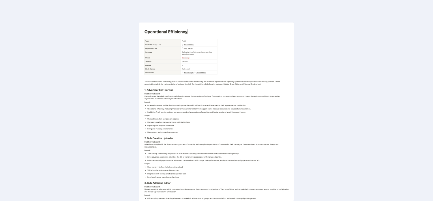
Portal
OPERATIONS / ANALYTICS DASHBOARD
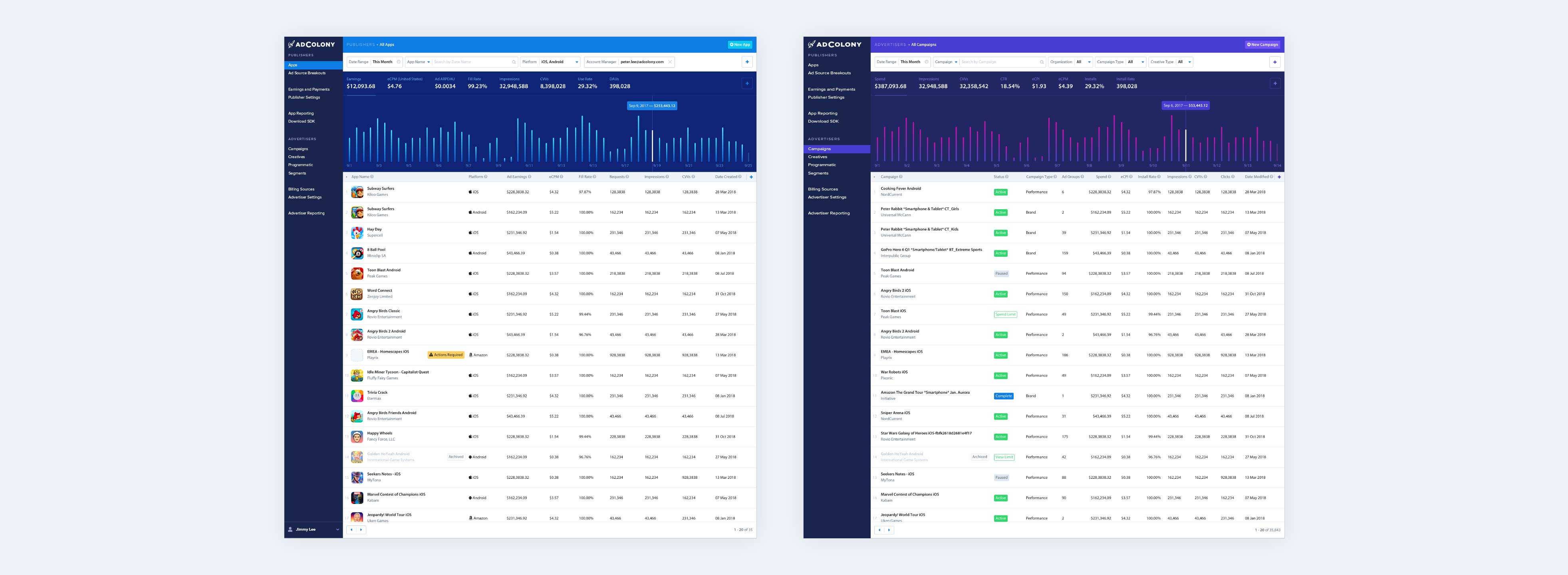
The Portal is a dashboard user interface that allows users to tap into AdColony's systems and services in order to create and manage Apps and Campaigns, the meat and potatoes of the network. The Portal is the primary touchpoint by every employee and client of AdColony multiple times daily to observe trends and manage performance across the network.
BACKGROUND
The Portal is the central operations and analytics dashboard for AdColony where everything was managed and assessed for performance.
`Historically, the company had leaned heavily on internal Account Strategists to guarantee advertiser success so having a white glove approach to campaign management was a core part of the company's DNA. This meant that all Campaign and Creative management was serviced by internal employees rather than directly by the advertiser.
THE PROBLEM
Restructuring left Ad Operations teams over capacity, resulting in increased customer churn
CUSTOMER PROBLEM
Delays in request fulfilment
Since advertisers relied heavily on AdColony employees to make updates to their ad campaigns, any delayed requests of even just a few hours could be especially frustrating.
OPERATIONS PROBLEM
Higher frequency of costly errors
Errors became more frequent, leading to issuing make-good credits to customers, resulting in revenue loss, sometimes in the 6 figures.
THE OPPORTUNITY
How might we preserve and increase customser satisfaction by optimizing the efficiency and accuracy of our operations teams?
USER RESESARCH
Deep dive into the workflows and trends of the Ad Ops team
Engaged with all 9 Ad Ops managers who were responsible for globally managing at any given point 2500 live Campaigns owned by 500 accounts. From our findings, I put together a document that outlined possible features that could be built into the Portal to address those problems.
User Interviews
Conducted user research to understand how Ad Ops was spending their time and to identify patterns in their workflow. Learned of their daily tasks, challenges, and pain points to gain deep insights into workflow taking note on common and redundant tasks that could be streamlined through automation
User Interviews
Analyzed Jira logs to categorize customer requests and quantify time spent.
APPROACH 01
Self-Service
Open up Campaign and Creative management features to accounts so that customers can apply changes as necessary especially when customer urgency cannot be met by the Ad Ops team.
PROS
- A meaningful reduction in customer requests.
- Empower customers to take control of Campaign outcomes.
- Satisfy long standing desire from many Customers for self-service capabilities
CONS
- Some Advertisers would need to be restricted from accessing certrain controls.
- Ad Ops would need to manually screen and approve Customer uploaded Creatives.
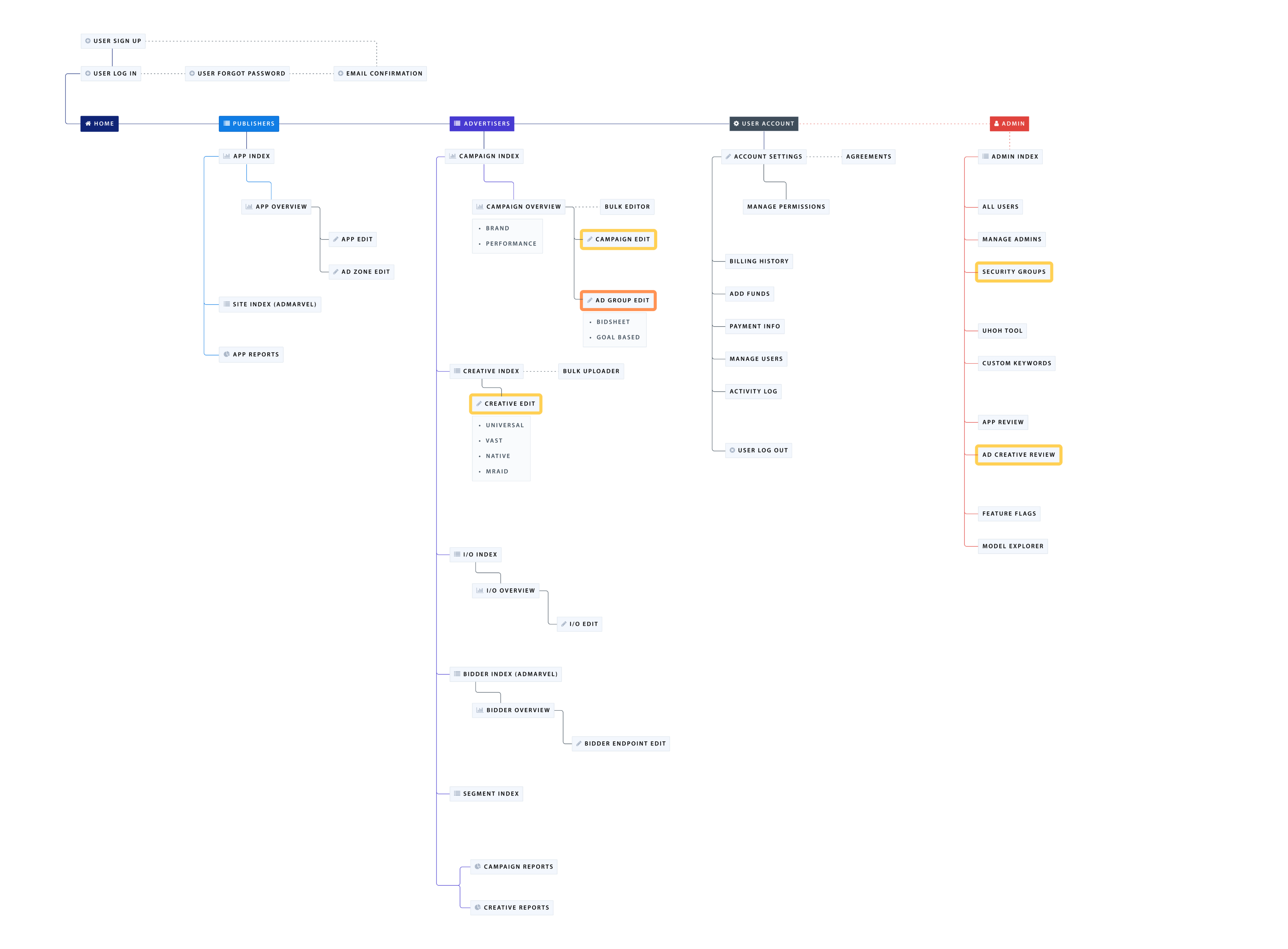
Above is the Site Map for the entire Portal. The sections in yellow represent the pages that would need to be either created or redesigned before opening up to customers for self-service. This case study will just cover the research and exploration involved with re-designing the Ad Group Edit page, highlighted in orange.
Ad Group Pain Points
During our investigation of the Ad Group Page, we uncovered several critical pain points that were hindering user experience and operational efficiency.
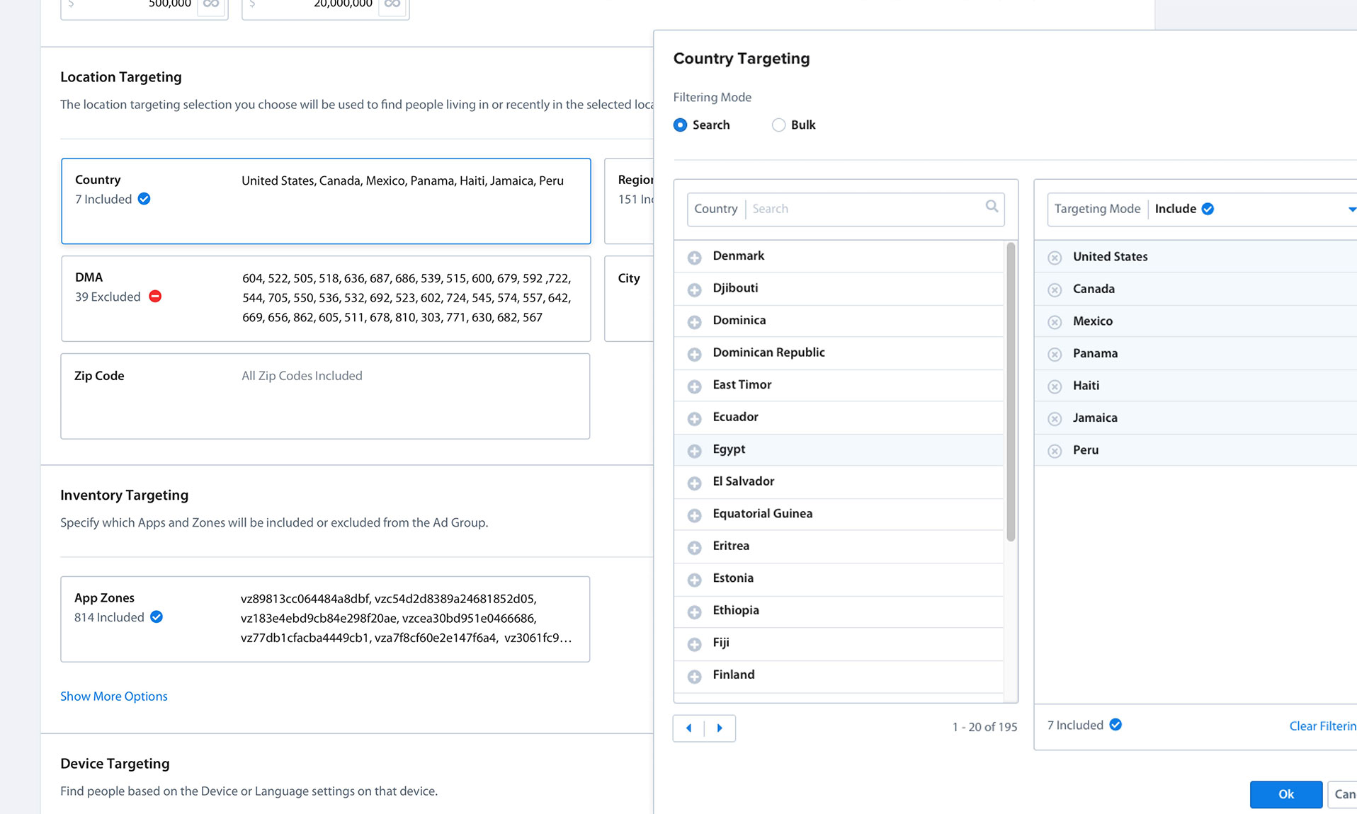
- Overwhelming number of targeting filters
Users were overwhelmed by the sheer number of filters presented on the Ad Group Page. - Difficulty understanding orienting which parameters were in use
Users had trouble remembering which settings were applied to which Ad Group, and when navigating to a given Ad Group, they found the presentation of information took time to comprehend. - Presence of commonly unnecessary fields
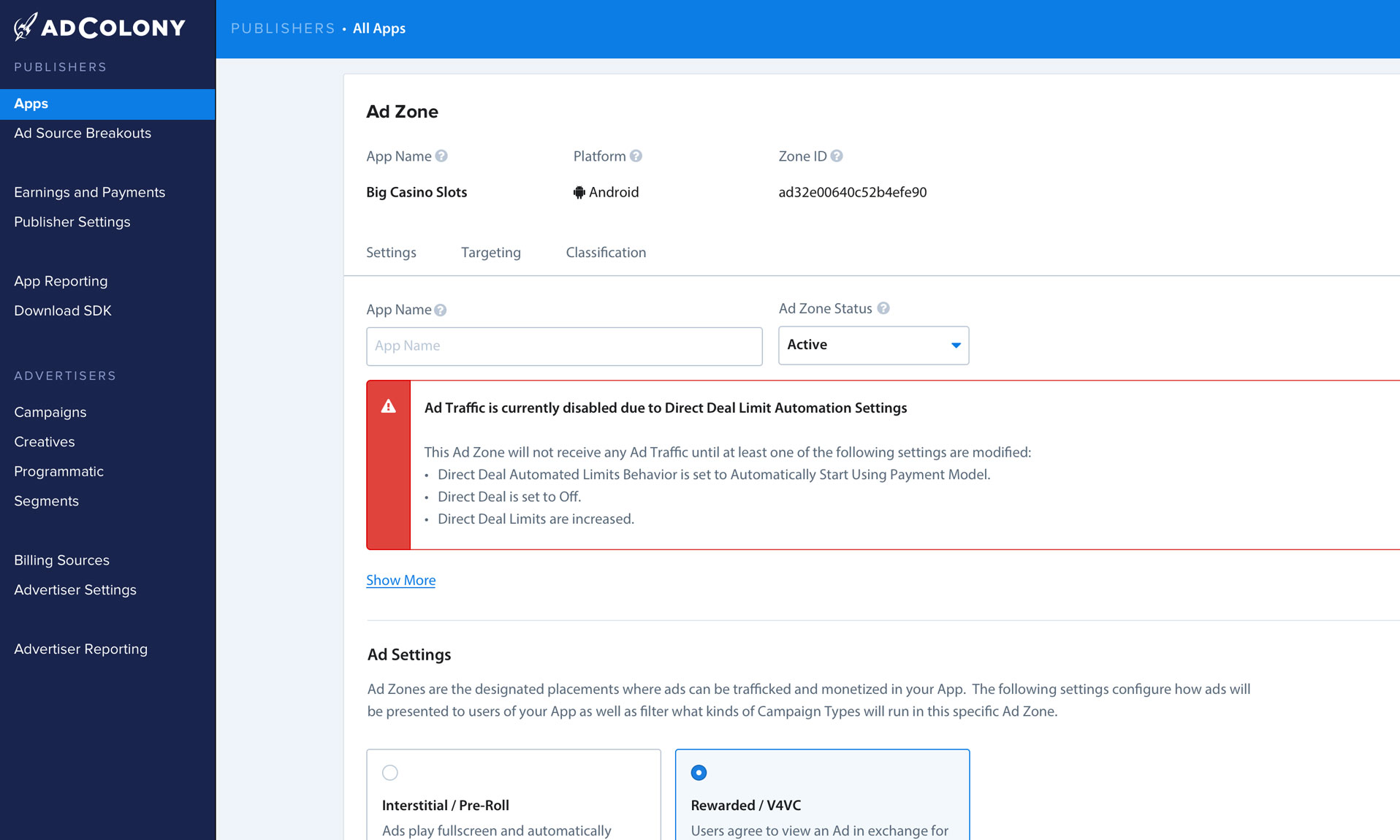
This was the longest, most complex page in the entire Portal, but many of the features at the Ad Group level were only used in niche cases, which left the page cluttered with unnecessary noise. - Lack of Creative identifying data
Users found it challenging to understand which ads were attached in a given ad group. The current solution required them to leave the page to dig into the specifics of the creative to find the right answers. - Dated visual design
The page had been un-lovingly referred to as the CVS receipt. It was extremely long and not pretty. The risk was granting customers access to this page could harm brand trust.
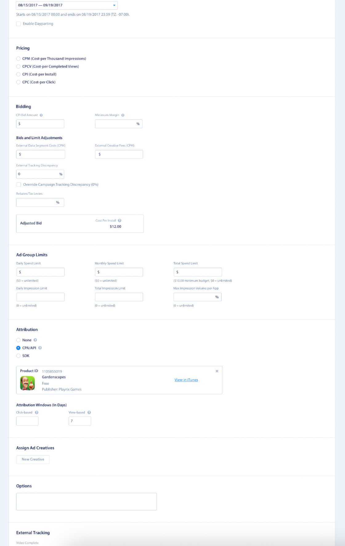
Legacy Ad Group page featuring an endless and organized set of targeting features.
DESIGN PRINCIPLES
Guiding principles I used to orient stakeholders around how possible solutions would be approached
I established a couple core design principles with the group to help guide the direction of our solutions. As concepts are explored and direction is refined we could always circle back to these design principles to help guide as to which concepts and ideas would yield the strongest outcomes.
Speed is King
Whether on an Ad Group page to understand the parameters in place or to make significant changes, a user should be able to carry out their intentions efficiently. Any modification to the user experience that would enable users to read or modify Ad Group parameters should be considered.
Scan and Understand
Enable users to quickly scan the page and understand the settings of their Ad Groups, improving overall usability and comprehension. Establishing a coherent information hierarchy and facilitating meaningful consistency in presentation will give users a stronger orientation on how to navigate and interpret such a complex set of features.
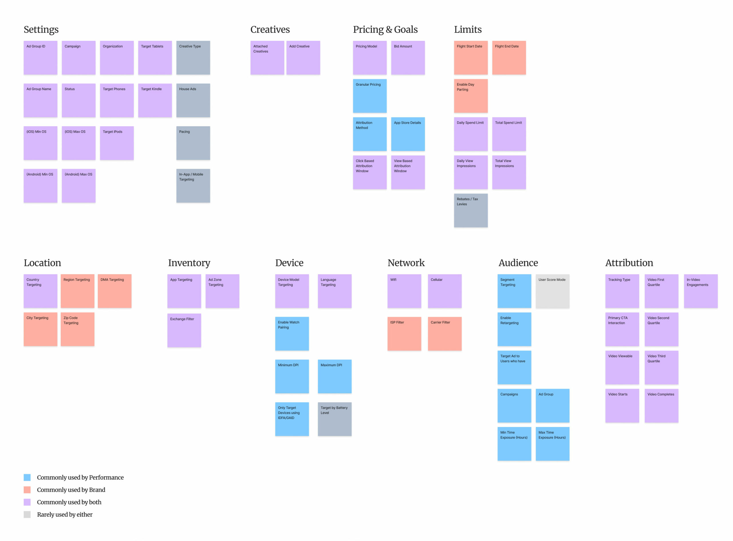
CARD SORTING
Organizing over 70+ ad targeting parameters to create a more organized and structured information architecture
There were over 70+ fields on the Ad Group page so I ran a card sorting exercise with 5 members of the Ad Ops team individually, trying to understand their shared mental model of all the available features.
I took special care to question if any arrangement or grouping of the fields was being preserved based on the existing layout of the page, just to prevent any biases and make sure the sequencing made sense even for incoming customers who wouldn't have seen the page before.
We were able to converge on the on a few core groups. I made special note of fields that were almost never used, as well as certain fields that were used very often, but irrelevant based on the Campaign type (being brand or performance)
EXPLORATION
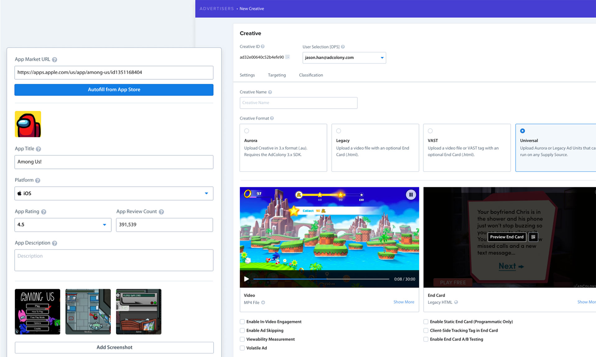
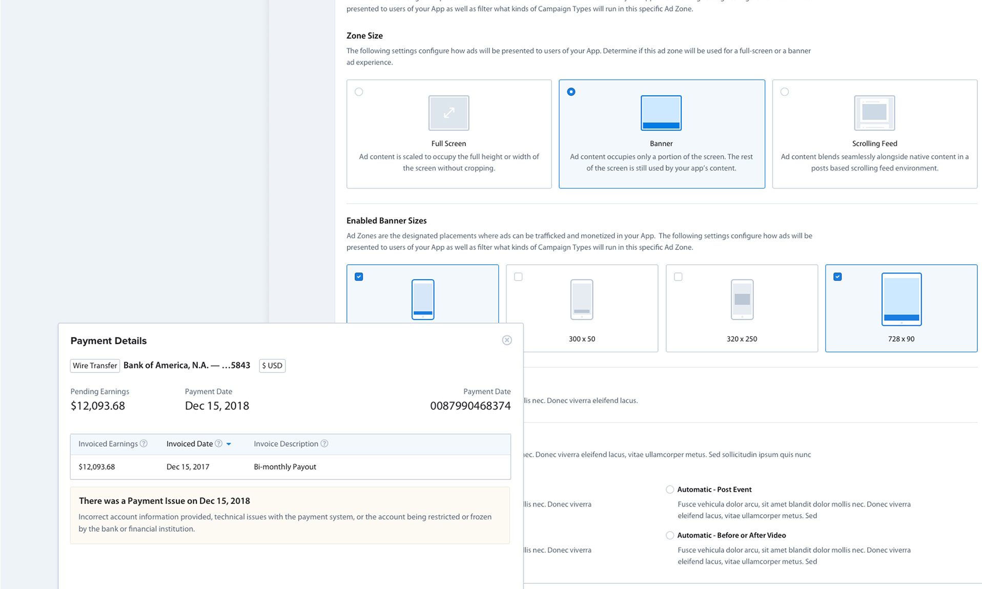
Bringing visual previews to attached Ad Creatives
Users had expressed that it was challenging to identify which creatives were attached in a given Ad Group, so it made sense to include visual previews alongside the creatives.
I made 2 different versions, one with a very prominent visual preview of the ad but with all other metadata removed from the UI, and another version that preserved the existing metadata and with a smaller preview thumbnail.
Unanimously, the feedback I received was that while the visual preview was very much needed, the performance metrics were also crucial since this view was the quickest way to associate if any potential issues at the Ad Group level were contained to one or several of the creatives.
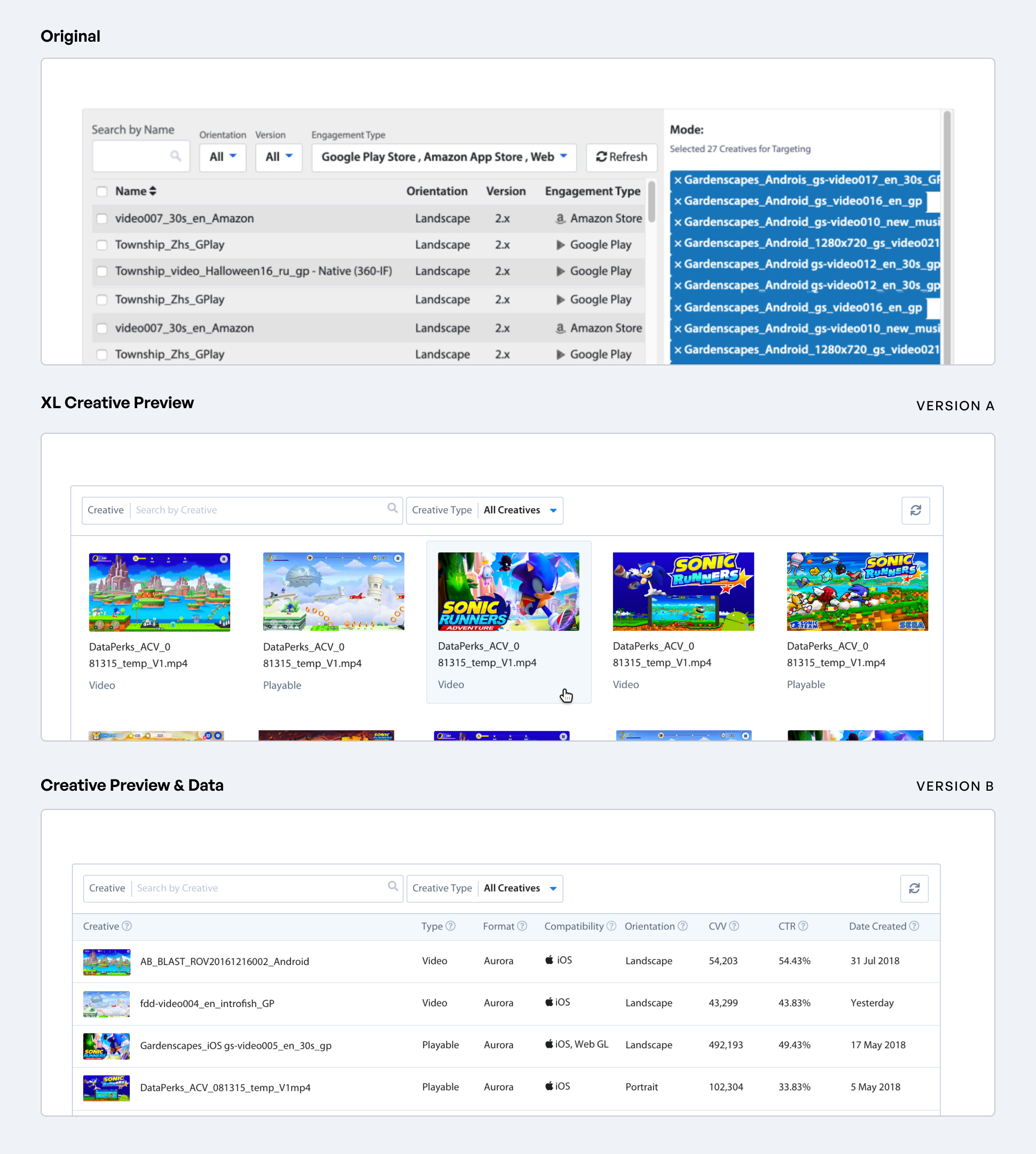
Learnings
- Users appreciated visual previews of Creatives for identification purposes but not at the expense of performance metrics, which was the quickest way to monitor Creative performance segmented by Campaign.
EXPLORATION
Setup Wizard
I also tried reformatting the page in a wizard layout, which was popular in many of the big ad dashboards like Facebook and AdMob, in order to address how overwhelming and jam packed this page was. Users would interact with only one section at a time, hiding the fields of all other sections until explicitly navigated to.
When I ran user testing, I was surprised to find that most people took longer to complete tasks in the wizard design vs the other design where all fields were visible at once.
For the users, the challenge was that it was still disorienting to remember which of the 70+ fields were located where, and expanding and minimizing each section one by one made searching for those fields even more cumbersome. I also realized that if a user was having trouble finding a field they would use the browser Find feature, but in the wizard design, only the fields in the active section would be searchable, rendering the browser Find feature useless.
Learnings
- In usability testing, majority of users expressed frustration when making changes to existing Campaigns being unsure which parameters were minimized in which section of the wizard.
DESIGNS
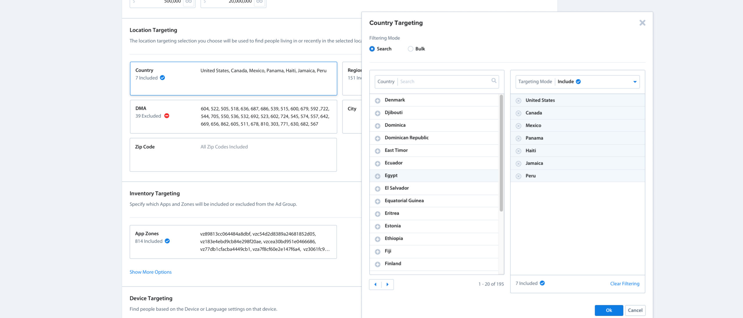
Targeting Filter Component
In order to help cut down on visual clutter, I designed a single targeting filter component that could be adapted to most other filters on the page. On the orginal ad group page, there were dozens of variations on different targeting filters, but they all did the same thing, which was allow for multiple selections to be made from a fixed list of countries, devices, apps, etc
My intention in the redesign was to make a consistent component where a user could quickly scan through several at once and identify which filters were being users in a given ad group and to what degree. The minimized version would show a brief summary of what targeting parameters were in effect for a given filter, and if desired,the filter would open to a modal, which would show the full parameters on the filter and allow users to make changes.
DESIGNS
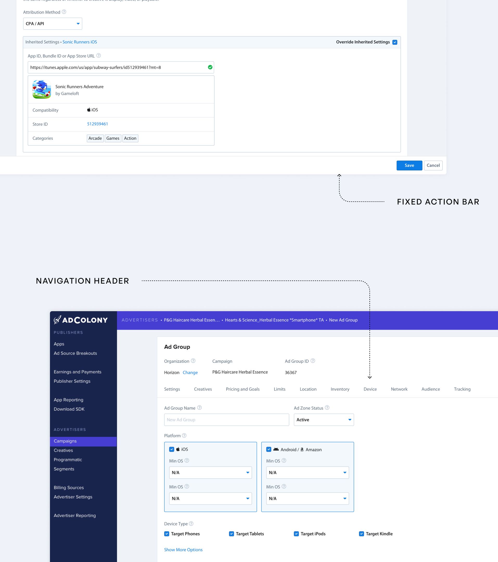
Navigation Header & Fixed Action Bar
For the redesign, I implemented a navigation header to streamline user navigation, providing quick access to different sections on the page and enabling one-click scrolling to desired sections.
The Fixed-Position Action Bar was where I relocated the save and cancel buttons, and this allowed the very critical save button to be available at all times on the page. During the research phase, I had seen users constantly scrolling if, for example, they were just making a quick change at the top of the page and then needing to scroll across the whole page just to hit the save button. it would be even more frustrating if there was a validation error, and the user would be forced to traverse the entire page again.
DESIGNS
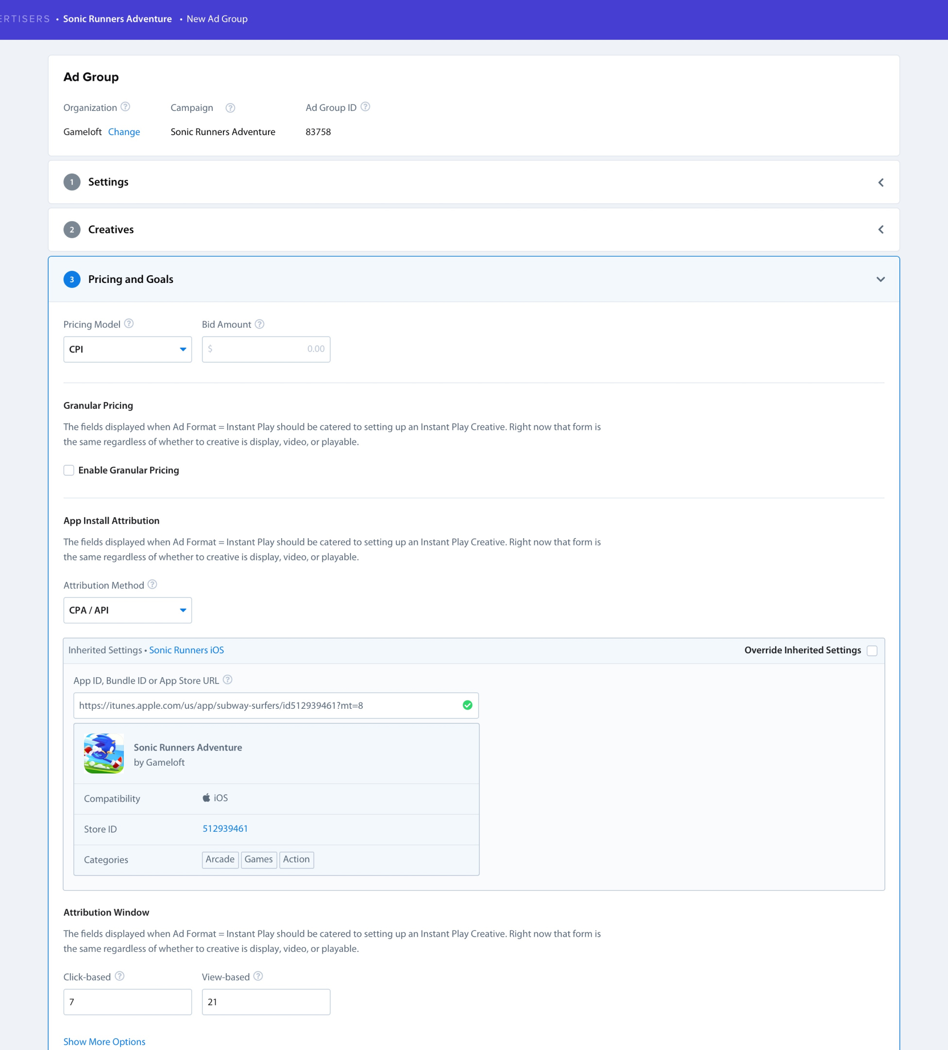
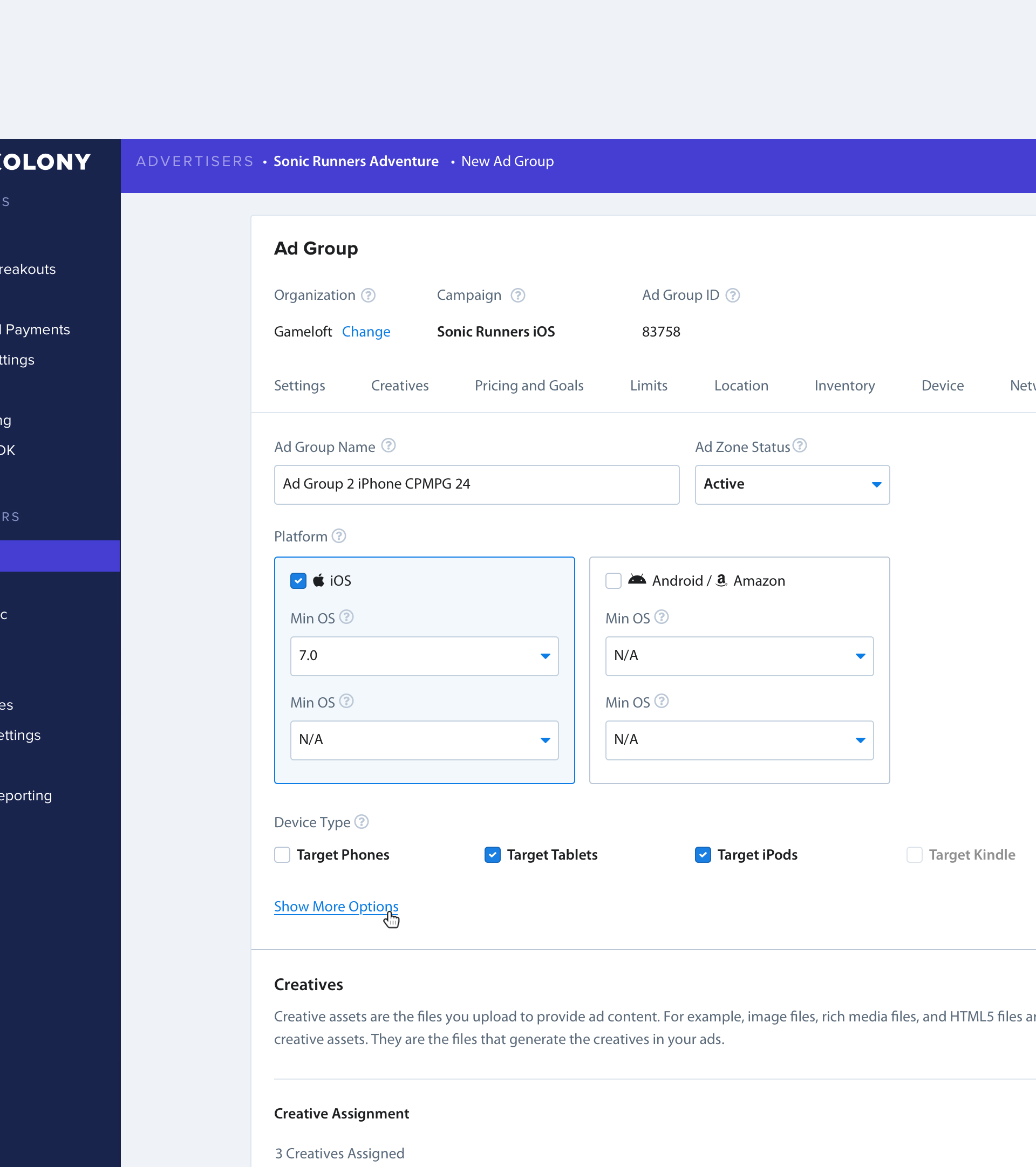
Smart Defaults & Goal Declaration
Uncovered during research that certain fields were only relevant depending on if the Campaign was a Brand or Performance Campaign. Added a new Goal declaration, and migrated existing Campaigns. Depending on Goal Type, if the field was unmodified from its default value, it would remain hidden. This approach allowed fields that were mostly irrelevant to be hidden from view, without needing to deprecate or remove potential features that had very infrequent use cases. This resulted in reducing clutter by hiding as much as 20% of total fields.
DESIGNS
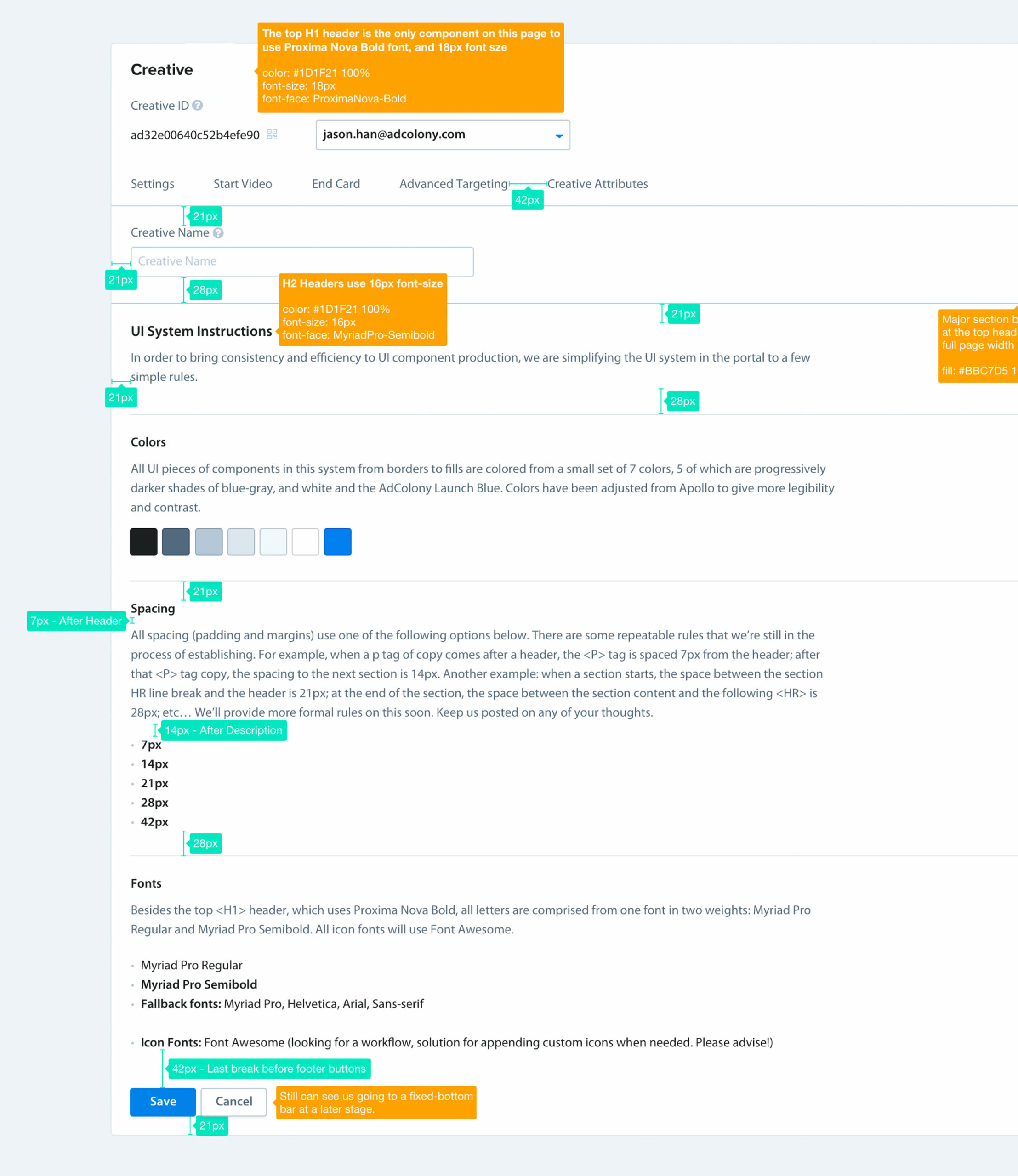
Quick Design System
We didn't have a component based design system so there was a lot of UI inconsistency throughout the Portal. Having worked with developers for years implementing designs, one of the most laborious parts of the process is getting all the pixel measurements correctly, and inevitably details get lost in the implementation process without lots of back and forth.
In order to move quickly I put together a minimal rule set around how I would style all pages and components: For example I only used one font family and 2 weights, all font sizes used 14px, and all margin and padding were divisible by 7px. This small set of rules was simple enough to empower engineers to implement designs accurately and quickly, while also updating other areas they saw fit ahead of me putting designs together.
SELF-SERVE ROADMAP
Other features that we shipped to enable a viable self-service experience for our advertisers
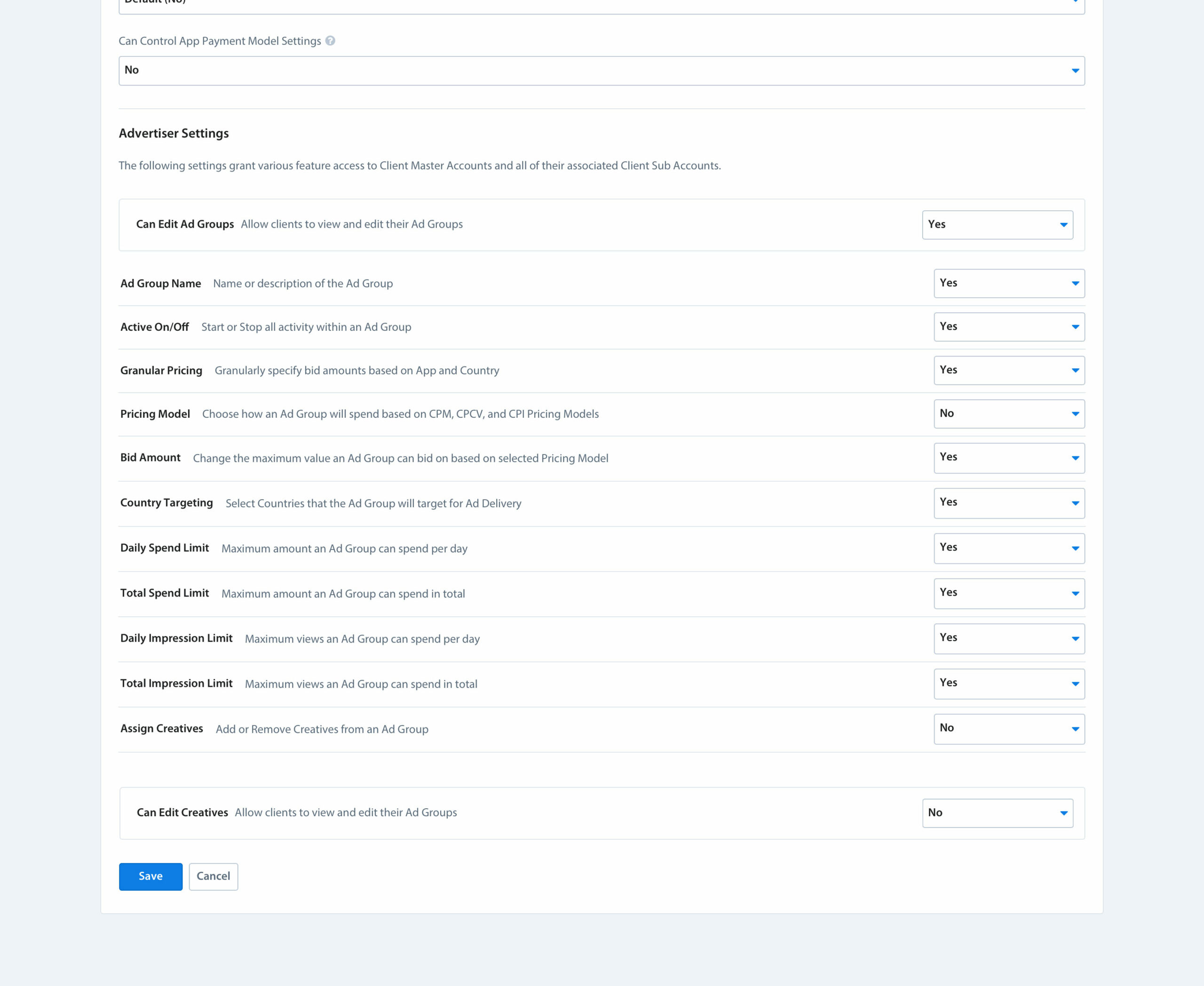
Permission Management
Granularly manage access of different self-service features for individual customers. This provided flexibility for Advertiser permissions to be customized granting certain customers broad abilities to self-manage their Campaigns, while restricting other users from being able to view or access features that could potentially jeopardize their Campaign outcomes.
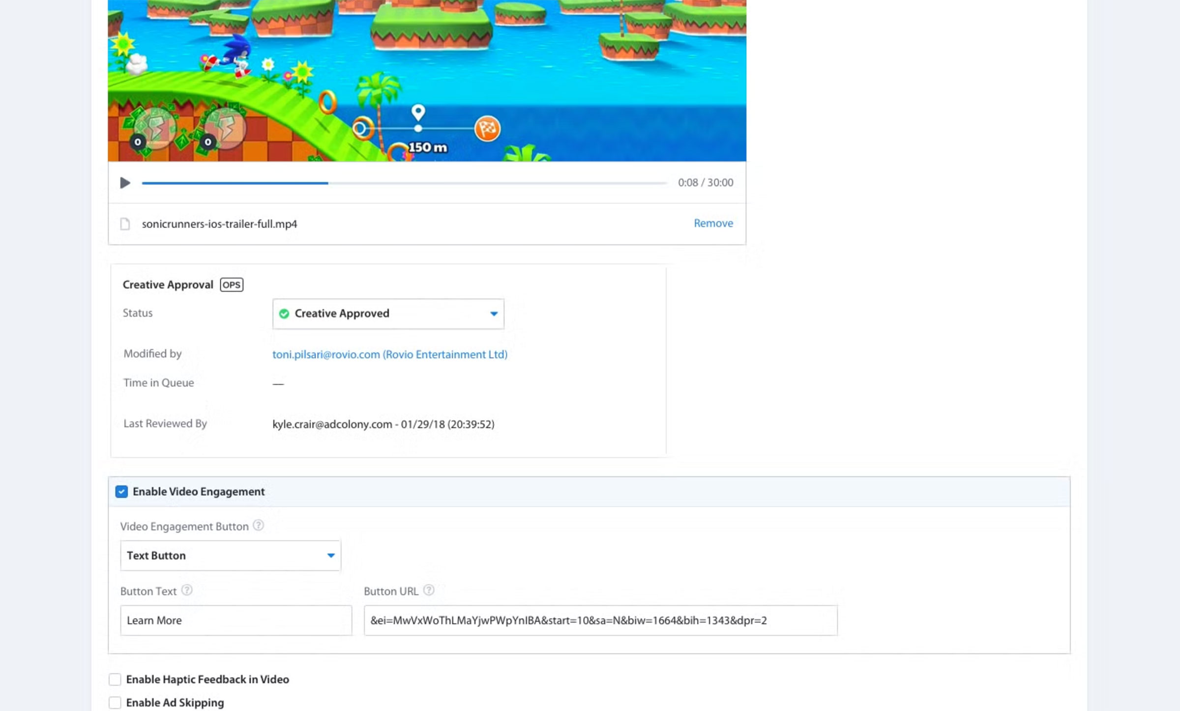
Creative Approval
New or modified video assets require approval by Ad Ops before serving. Allowing Advertisers to upload their own Creatives took a significant burden off Ad Ops, but also meant that these Creatives would need to be pre-screened for content appropriateness and accurate content tagging to ensure Publishers who showed these ads in their app were in control of ad content that was delivered to their users.
OPERATIONAL EFFICIENCY ROADMAP
Additional features that helped scale Ad Operations efficiency
Bulk Creative Uploader
PROBLEM
Uploading videos was one of the most time consuming tasks for the team. We discussed a previous request that required 600 video ads to be trafficked, taking 50 man hours to complete.
SOLUTION
The bulk uploader allowed for simultaneous upload of multiple creatives, while sharing preset settings like tags, languages, and platforms, eliminating repetitive manual input.
OUTCOME
After testing the initial prototype, the team estimated that the same task could be done in about 5 hours with the proposed tools, which was an 83% reduction in time savings.
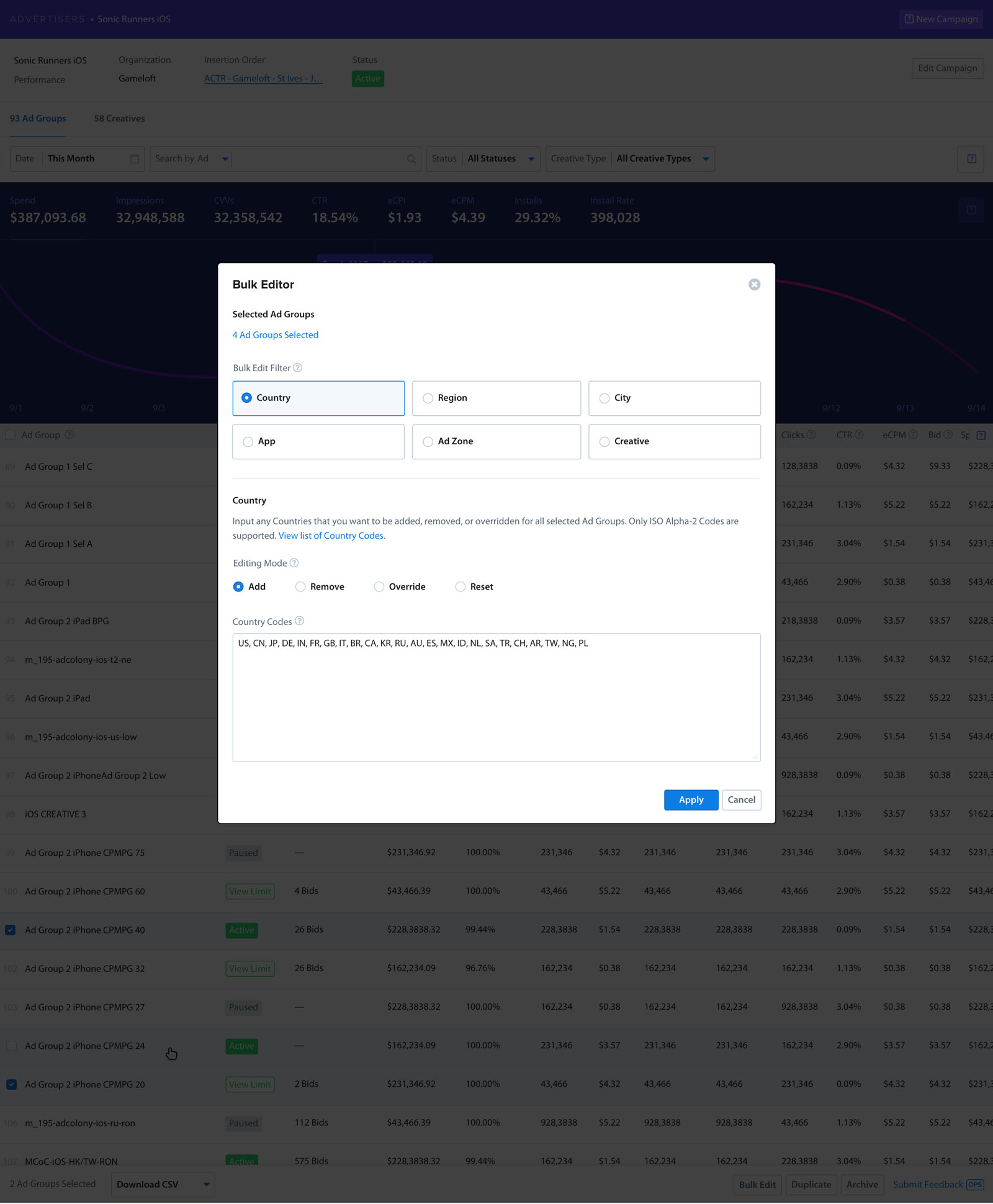
Bulk Ad Group Editor
PROBLEM
If the advertiser wanted to add that app to say 40 ad groups Ad Ops would need to manually navigate to an ad group, target the new app, save, and then repeat that 40 times.
SOLUTION
I partnered with another team to execute this feature, allowing a single creative to be automatically processed into 3 separate formats but packaged into 1 ad. The right ad format would be served depending on the requierments of the supply source, which eliminated a lot of redundancy
OUTCOME
After the feature went live, I led a multi-staged migration effort to re-publish all our existing active creatives into this new format to ensure all ads were maximizing their potential reach
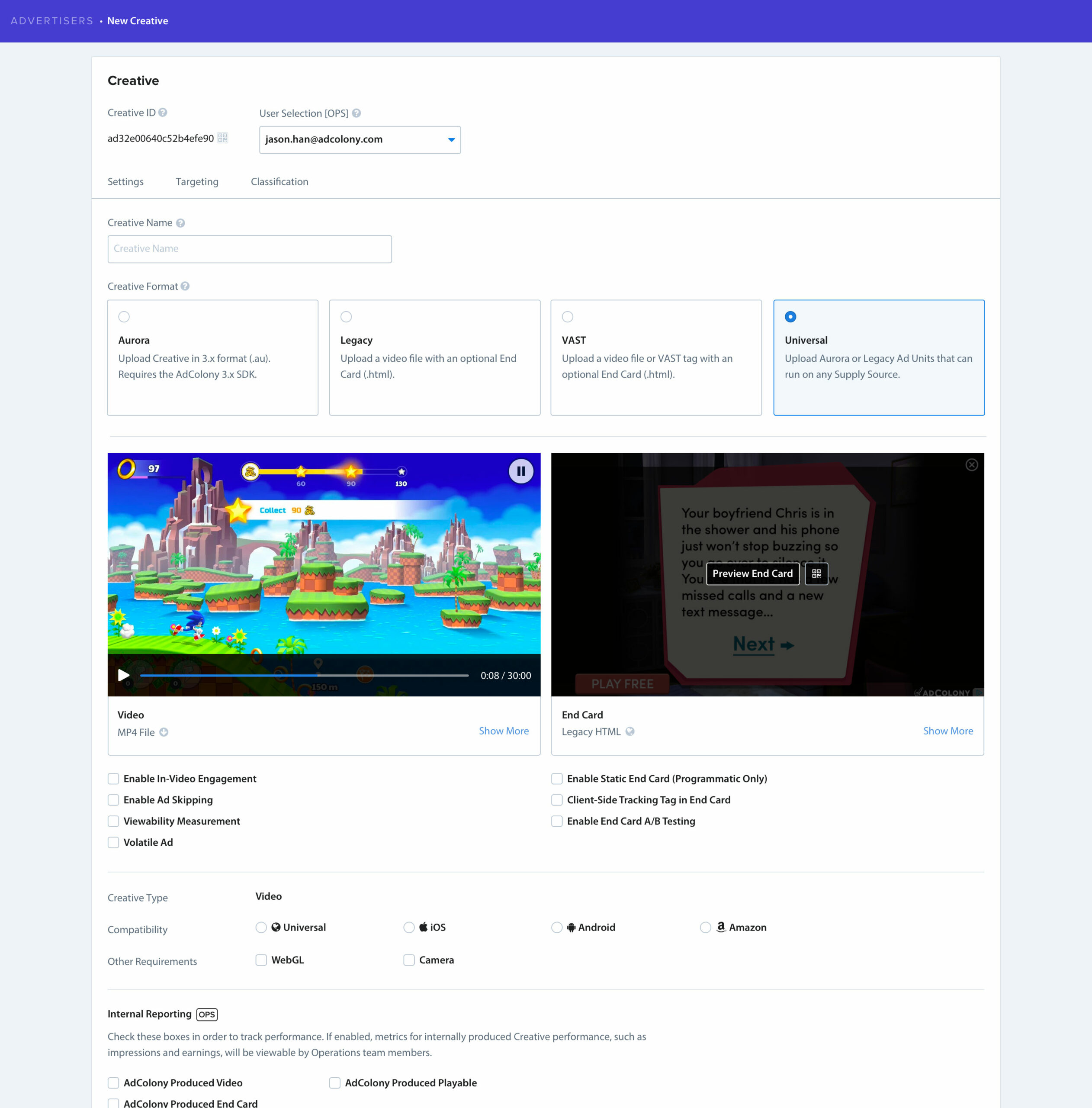
Universal Creative
PROBLEM
Universal Creative was born out of the fact that in order for an ad to maximize its reach across our network, other exchanges, and our legacy SDKs, an ad would have to be uploaded and trafficked up to 3 times.
SOLUTION
I partnered with another team to execute this feature, allowing a single creative to be automatically processed into 3 separate formats but packaged into 1 ad. The right ad format would be served depending on the requierments of the supply source, which eliminated a lot of redundancy
OUTCOME
After the feature went live, I led a multi-staged migration effort to re-publish all our existing active creatives into this new format to ensure all ads were maximizing their potential reach
OUTCOMES
Our focus on operational efficiency was a lifeline for the hands of our business
Reduction of "make-good" penalties & improved customer satisfaction scores
I partnered with another team to execute this feature, allowing a single creative to be automatically processed into 3 separate formats but packaged into 1 ad. The right ad format would be served depending on the requierments of the supply source, which eliminated a lot of redundancy
Notable improvement in morale amongst operations teams
The release of each feature had a positive impact on the Ad Ops team, noting the impact these features had on their day to day workflow and productivity. It was also deeply satisfying to ship features that directly benefited the productivity of my colleagues.
Increased velocity in shipping UI related features
Simplified style guide empowered engineers to make visual design decisions without needing design approval, resulting in less time adjusting pixels and less time managing visual QA tickets.
PORTAL TEAM
Design & Product Management: Brandon Chau
Engineering Lead: Troy Tabrilla
Engineering: Maxime Preaux
Engineering: Anwar Ziani
Quality Assurance: Brian Lathrop
©2020 Brandon Chau — bchau.com