Composer
CANVAS BASED AD BUILDER
Composer is a web-based Ad Builder designed to enable our Creative Team to produce best-in-class Interactive and Video Ad Units for mobile without writing code.
I lead the team through a ground up redesign of the interface, directing design systems and user experience with Product Design, running user interviews with Creative, identifying and advocating areas of focus with Product, and facilitating implementation with Engineering.
THE PROBLEM
Usability issues were preventing designers from expressing themselves creatively
Composer is the name of a very capable web-based Ad Builder web application that was inherited to AdColony through an external acquisition. The tool was feature rich and had a lot of potential, but was also generating a lot of frustration amongst the Creative Team due to the tool's complexity and lack of usability features familiar in traditional Creative tools, which resulted in the learning experience being both extremely challenging as well as unreliable
In Composer's current state, the Creative Team, an internal production team, was becoming progressively more reluctant to adopt the tool into regular production processes.
Screen captures of the intial user interface of Composer.
WHY IT MATTERED
Ads designers chose to produce ads in other more expensive ways
The Product Design team was brought in to overhaul the Composer UI to improve usability and to incorporate familiar design patterns and features that Creatives were more familiar with in order to boost onboarding and productivity. If the tool could be successfully adopted by the Creative Team, the result would be more scale in Ad Unit production without the need to scale engineering resources.
Engineering Support
We had a separate Engineering team dedicated to Ad Unit production that had been outputting custom Ad Units for high paying clients since the inception of our services. The objective was to progressively move these engineers towards supporting the development of Composer features rather than spending their time on creating custom one-off Ad Units.Third-Party Tool Margin
The Creative Team had previvously been relying on a third-party Ad Unit, Celtra, tool that was satisfactory, but resulted in a fraction of our ad sales to be paid out in exchange for its use. The objective would be to diminish usage and dependency on Celtra while simultaneously increasing production through Composer in order to lower marginal costs.
A picture of success would see Ad Units produced in Composer increasing while Ad Units requiring Engineering Support or Celtra simultaneously decreasing. The result would be a decrease in turnaround time and third-party fees.
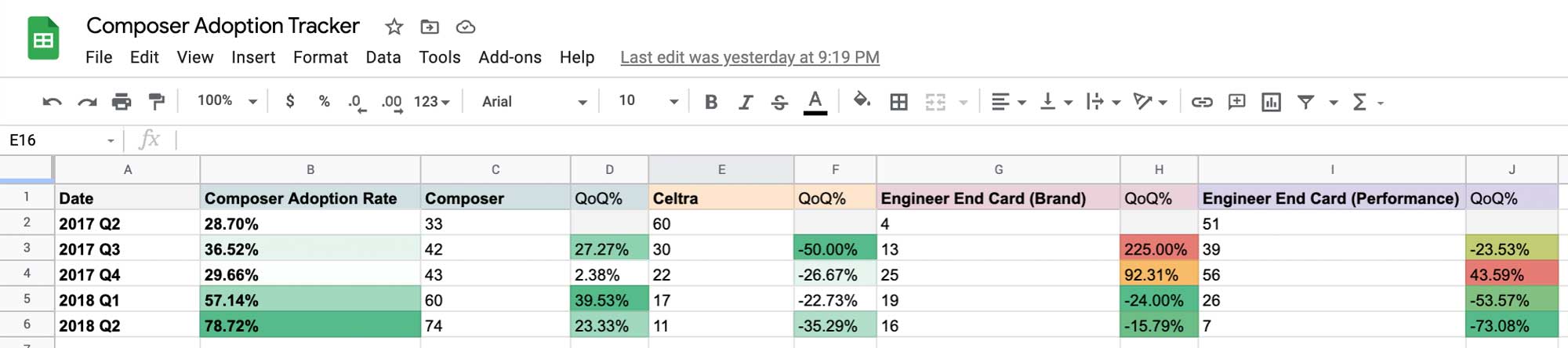
Tracking success through adoption rate of Ad Unit production amongst different ad builder options.
USER RESEARCH & DEFINING PERSONAS
Considering the distinct types of ads being produced on for our ad network
It was important to interview the users from the Creative team who were using the tool the most and pushing the tool as far as possible. The Product Design team conducted several interviews with members of the Creative team to observe their dominant use cases and pain points.
It was clear that there were a few distinct user groups that could make use of Composer in different ways to suit their individual needs.
- Interactive Ad Creatives
Ad Units from Brand were extensions of television commercials, which resulted in lots of hotspots, overlays, and galleries. - Playable Game Demos
A new type of Playable Ad Unit was gaining popular in the industry, which would allow users to experience a small sample of gameplay in the Ad Unit. - Account Management
Non design users were also being encouraged to create End Cards for their clients within Composer in order to circumvent engineering resources, saving cost and time.
Exploration, Collaboration, and Transparency
We relied heavily on power users on the Creative Team who were using Composer the most often and were pushing the bounds of what the tool was capable of. Thankfully, these users were more than happy to meet with us on a regular basis to expose their pain points. We ran several user interviews documenting their use cases, recording their projects, and validating our designs to make sure we were moving in the right direction.
Through these interviews we were able to identify opportunities where workflow optimization could drastically improve the fidelity of the creation process. We partnered with Creatives to observe their most intricate Ad Units, and documented step-by-step their process to achieve the desired outcome. We used these Use Cases/User Stories to guide our design process.

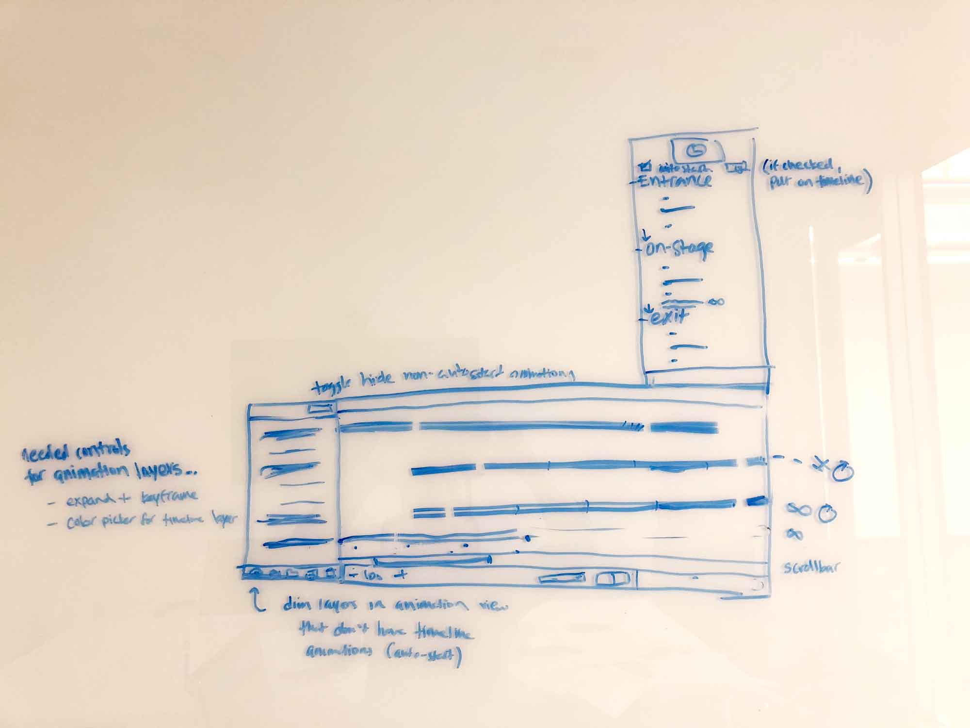
Some whiteboard sketches from a user interview session going over some of the major use cases for Timeline vs Event Based Animations.
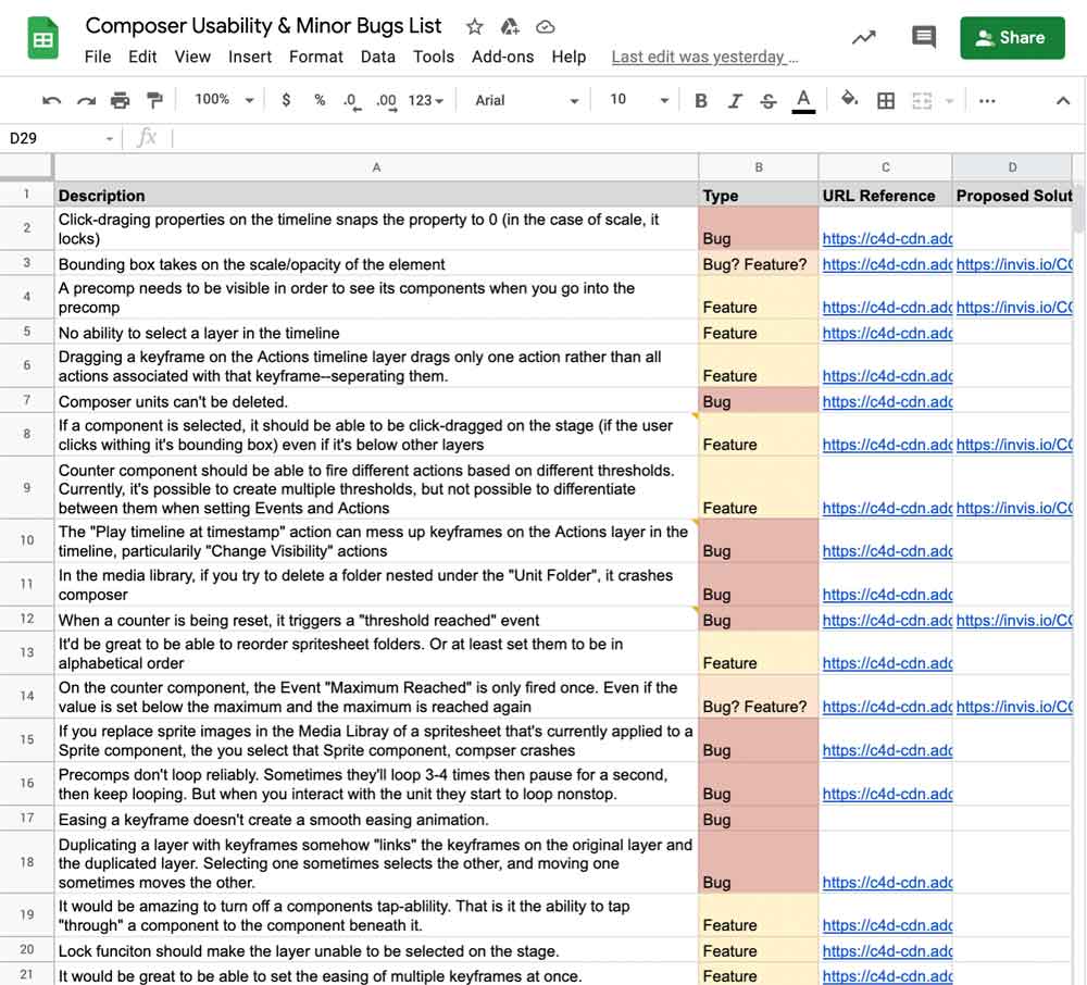
Opening channels for user feedback and tracking frustrating bugs and usability issues that had previously been siloed to the backlog
We also created a dedicated Slack channel for the Creative Team to post usability issues and design feature requests. The Product Design team assisted Product in documenting bugs and minor (non-blocker, but frustrating) bugs, and helping prioritize a few fixes with each Composer sprint/release.
Documenting the many usability issues and minor bugs. The Product Design team lead the charge in helping to prioritize minor issues that weren’t complete blockers but still impacted quality and user performance. We advocated for at least a few to get prioritized into each release.
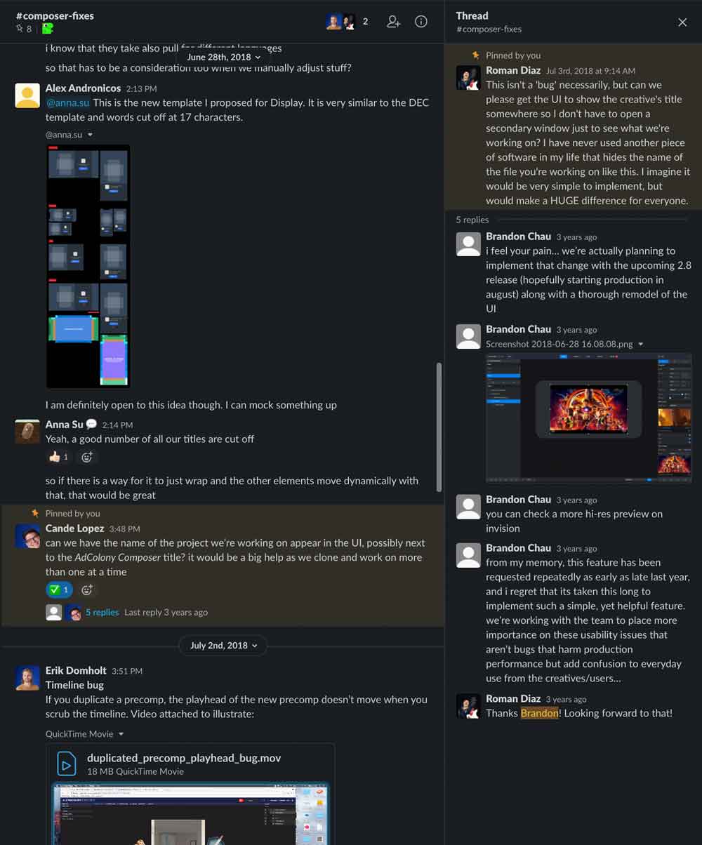
Slack Channel #composer-fixes was dedicated to keeping communications open with the Global Creative team regarding usability issues and minor bugs, as well as communicating status for feature improvement.
MARKET RESEARCH
Learning From the Best
In order to reduce confusion and learning curve, we needed to create an interface based on familiar design patterns from common design tools used by the team. The intent was to design the interface to feel like an extension of tools the team were already using in their daily production stack such as Adobe After Effects and Adobe Photoshop, and similar tools used to build mobile standard web ads such as Celtra and Google AdBuilder. We also took cues from leading design tools such as Sketch, Framer, Invision, Webflow, and even Keynote.
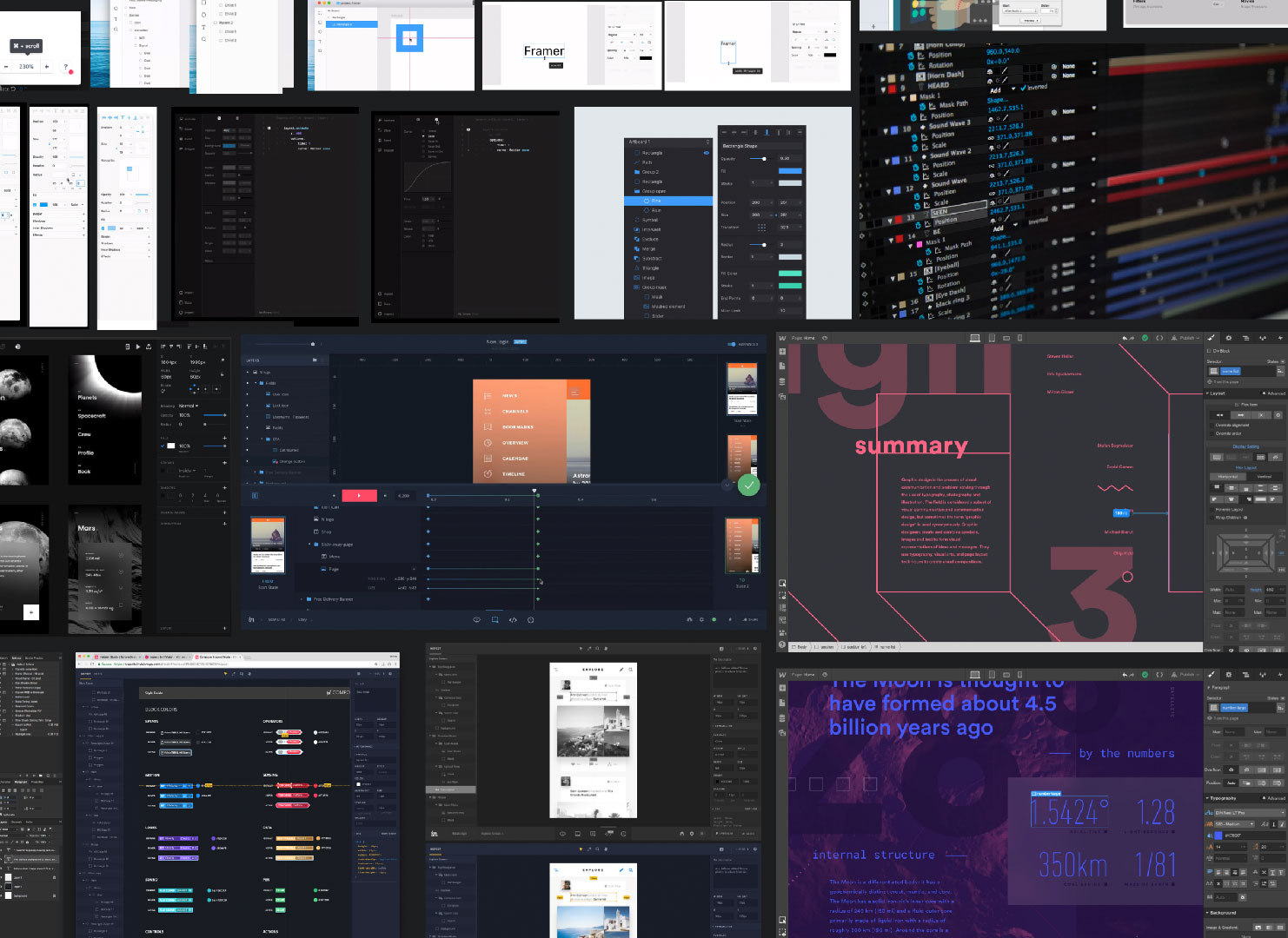
Moodboard featuring user interfaces of best in class No Code Creative Applications.
Taking Inventory
Given that Composer was already developed and functional, we had to retroactively take audit the all objects across the tool, and account for how each would be eventually refined as part of the redesign.
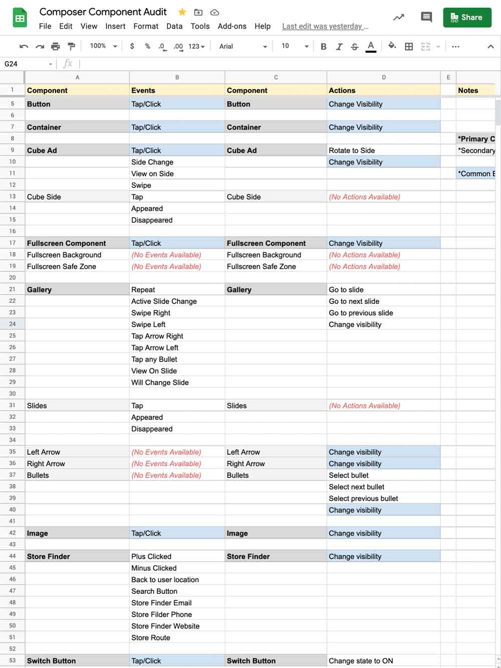
Taking inventory of all Components and relevant properties, actions, and events in Composer.
DESIGN SYSTEM
Laying Out the Foundation
A cohesive design system is crucial to any user centric product, as it promotes consistency, speeds up development, and provides user familiarity. From the user interviews and market research conducted, we constructed a design system based on the following core principles.
Core Design System Principles
- Canvas First
Through our user interviews, it was evident that every use case revolved around the Canvas, on which all objects are scaled, positioned, and arranged. It was imperative that we give the Canvas as much real estate as possible whether the user is workfing from a laptop or a large format monitor. One of the most asked features from users was the ability to zoom into the canvas to help ensure all objects were lined up perfectly to the pixel. A dark themed UI would further allow the canvas to stand out, and also just look really slick! - Objects in View
We uncovered from our user interviews that some of the most jarring workflows were those in which the selected object is hidden by some UI module. This would often occur due to a modal blocking the interface as editing was occurring, or an unclear outline causing the object to get lost amongst other objects in the canvas. The vast majority of UI elements would be pushed to the sides wherever possible to ensure objects on the canvas were not obscured. - Density and Legibility
Each object on the Canvas could have scores of different parameters that could be configured. During user interviews, we consistently observed users scrolling and searching for various parameters, which caused significant distractions and delays. Our objective would be to design a compact component system to allow as many of these parameters to exist within available screen real estate simultaneously. - Accessible Media Previews
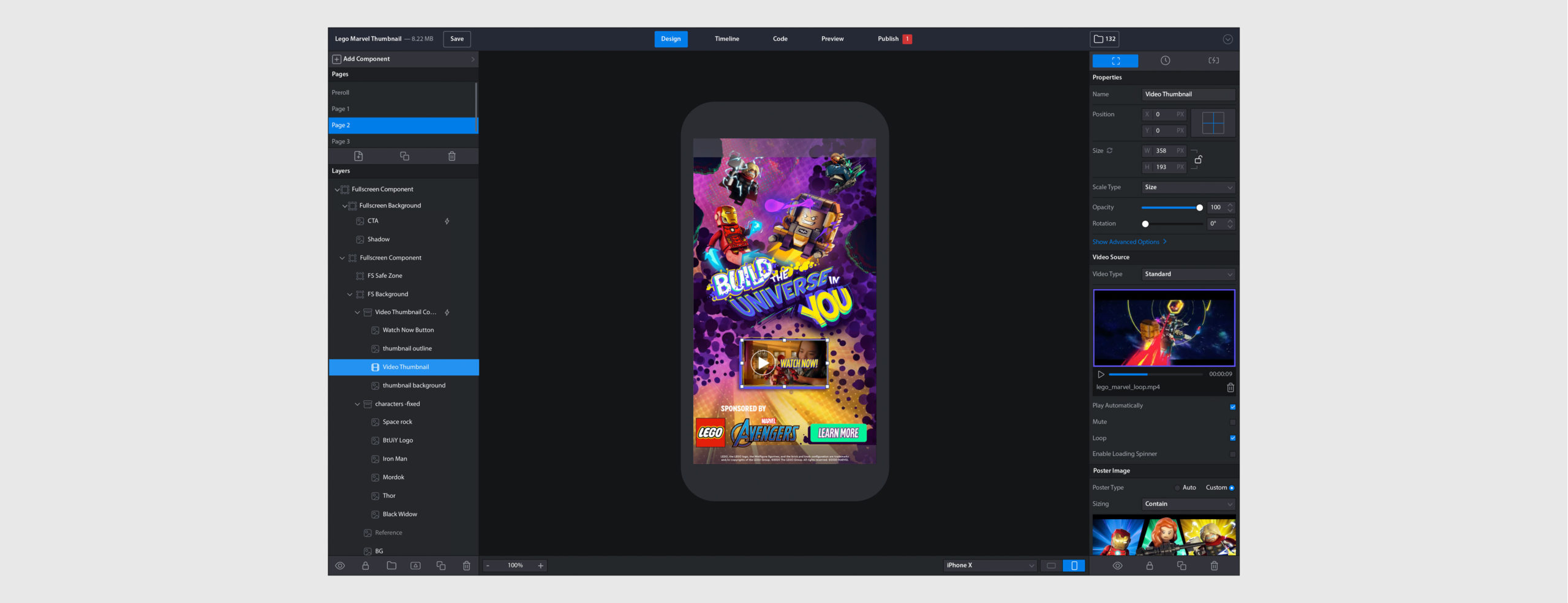
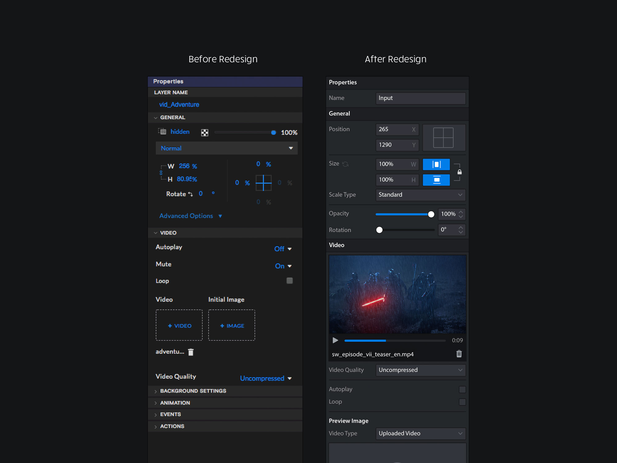
Previewing media could only be done directly on the canvas. This is acceptable for static images, but consider a button that has several states or a video that has thousands of frames within the same file. The current UI did not offer users the flexibility to freely observe all aspects of media objects.Whenever possible, our goal would be to offer opportunites to reveal and preview all states of an object and its associated media assets. - Accurate Controls
The current UI controls lacked granularity and accuracy. When selecting an object, the bounding box border was thick and dashed; objects could not be moved in fixed straight axes; without arrow keys or zoom capabilites it was nearly impossible to be pixel accurate when aligning assets. As we designed the UI we would seek opportunities to optimize precise control when postionin and scaling assets to match the vision of the user.
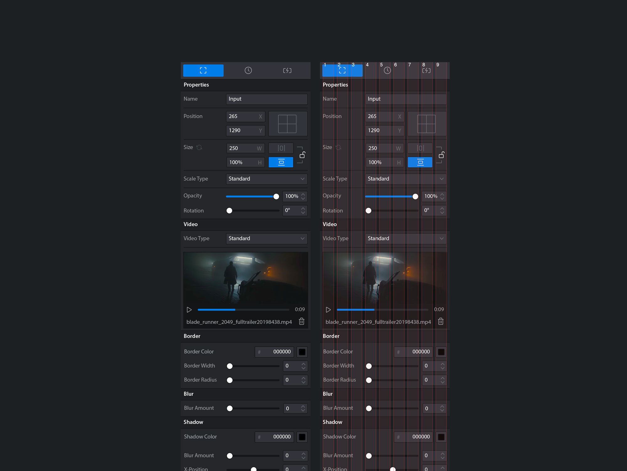
Fixed Sidebars, Fluid Canvas
As a design tool, the primary focus is the canvas where assets are positioned and scaled as planned for the Ad Unit. Our objective was to create a compact, high-density set of components that could stack neatly within fixed-width sidebars aligned against the available browser window, allowing the canvas to occupy as much space as possible, while ensuring as many UI controls were visible within the available browser window.
Layout Grid System
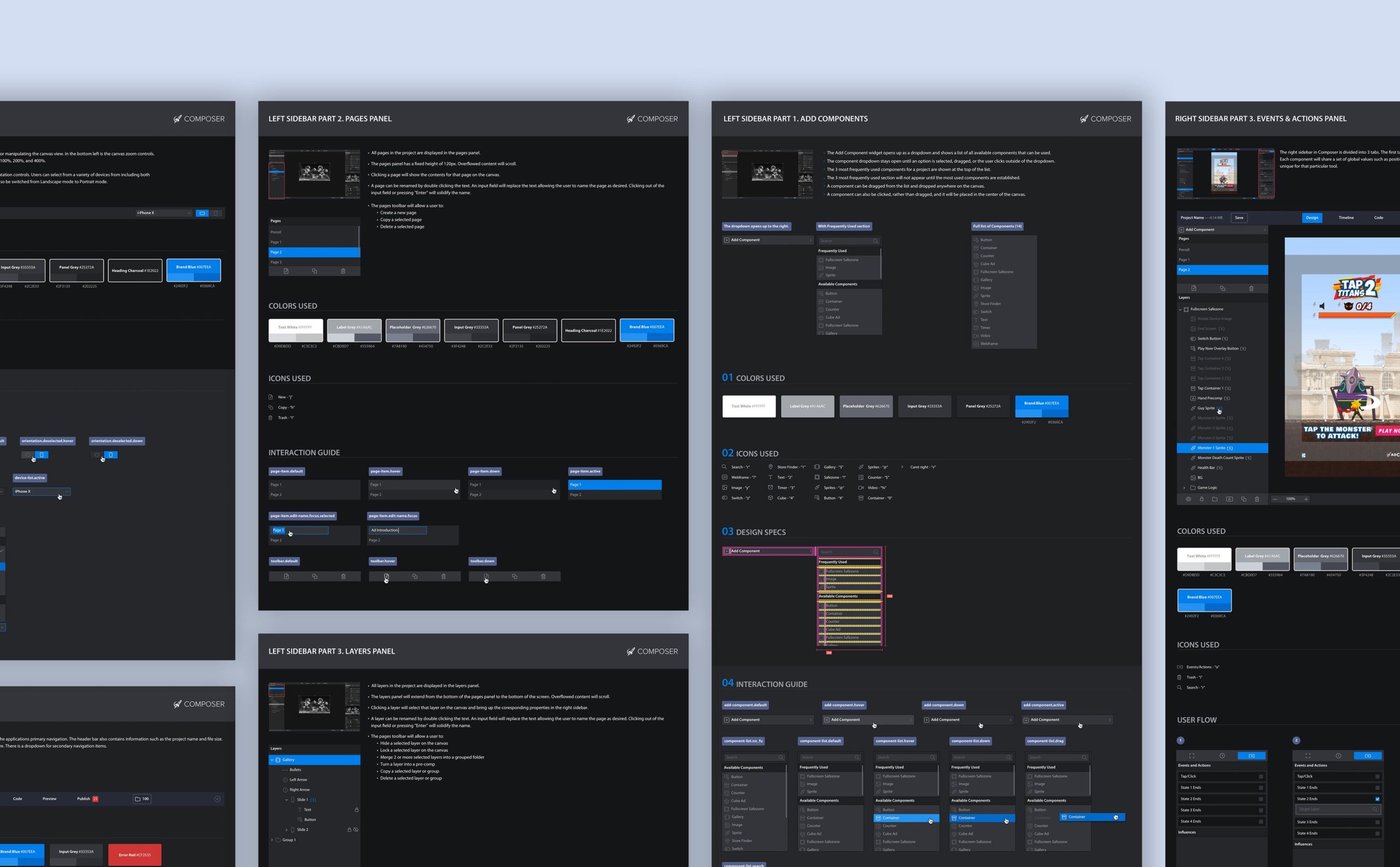
To achieve a consistent layout rhythm, a 9-column grid was created, which offered enough granularity and flexibility for sizing and positioning the various UI components within the sidebars, which housed the majority of UI. The sidebar and layout grid were non-responsive in order to allow the canvas area to occupy as much of the available browser window space as possible.
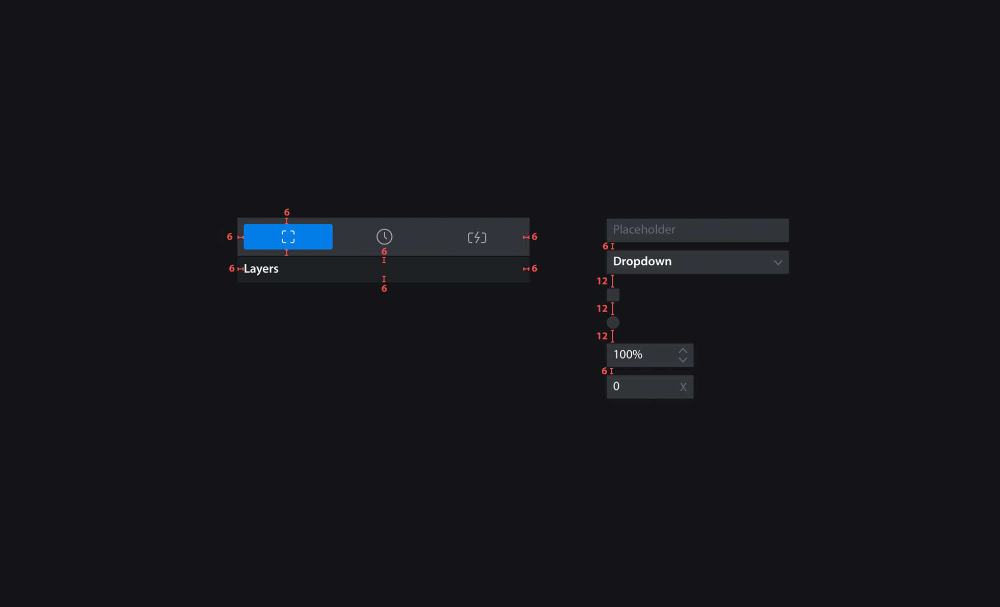
Margin/Padding
For ease of implementation and to reinforce layout rhythm, all sizing was based off of a base-6 multiple. This helped create a consistent vertical rhythm throughout the UI.
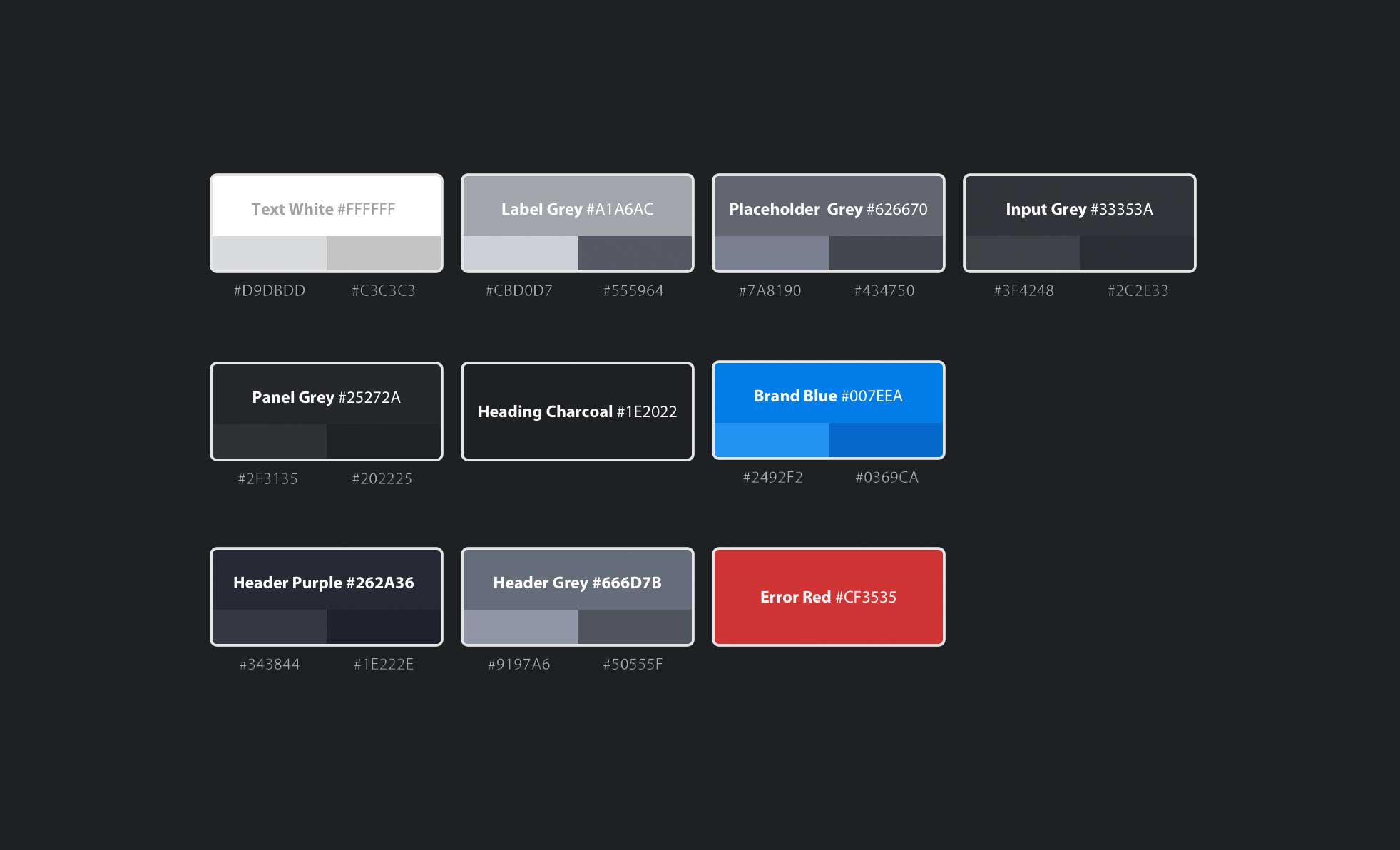
Colors
A simple color palette was refined to an 8-scale grayscale, an on-brand primary color, and an error highlight. Hover and active states were layered for each color.
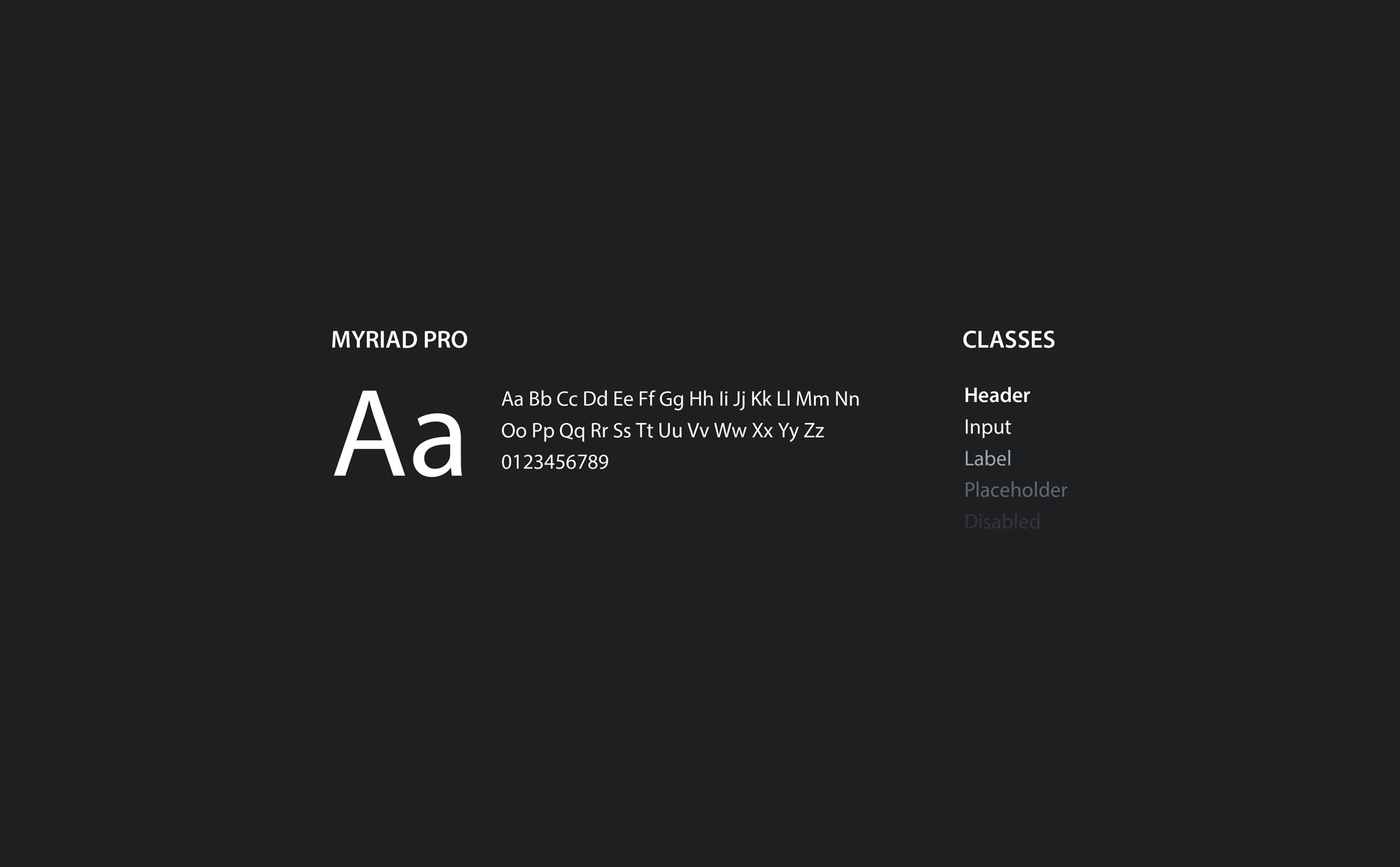
Typography
For simplicity, we used a single font: Myriad Pro, in two weights: Regular and Semibold. All UI typography would be fixed at 12pt, while a separate sizing system would be used for description text in Wizards and Publishing modules.
Iconography
We created a custom icon set that was clear, minimal, and consistent. Icons were converted into an icon font using IcoMoon in order to maximize ease of implementation on behalf of developers.
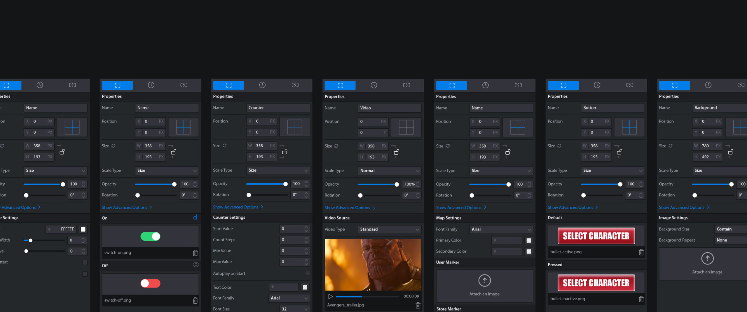
Components
All 50+ UI components, including all relevant states, were detailed within a single page and hosted on Invision. Individual components associated with each section of the Composer UI would be recalled at each relevant Style Guide.
DESIGNER/DEVELOPER HAND OFF
Design Handoff as User Experience
Our intentions for the Design System from the start was to be simple in comprehension and minimalistic in rules. We chose simple logical rules that could extend across the entire design system so Developers weren't spending time constantly referring to documentation. Questions about the core rules were simple and few enough to be recalled at any point and easy enough to digest and memorize.
The outcome of such a simple design system meant that there was minimal design bugs/revisions needed, and for the most part implementation went extremely smooth throughout the project with the simple details of the system being easy to recall.
In addition, over 25+ Style Guides were created to describe the design requirements for each section of the Composer UI. An additional Master Foundation Style Guide was created to overview the core foundational design patterns that governed the majority of the UI.
For each section of Composer including each individual object sidebar, a separate Style Guide was created, which included all associated components and states, as well as an overview of all design requirements.
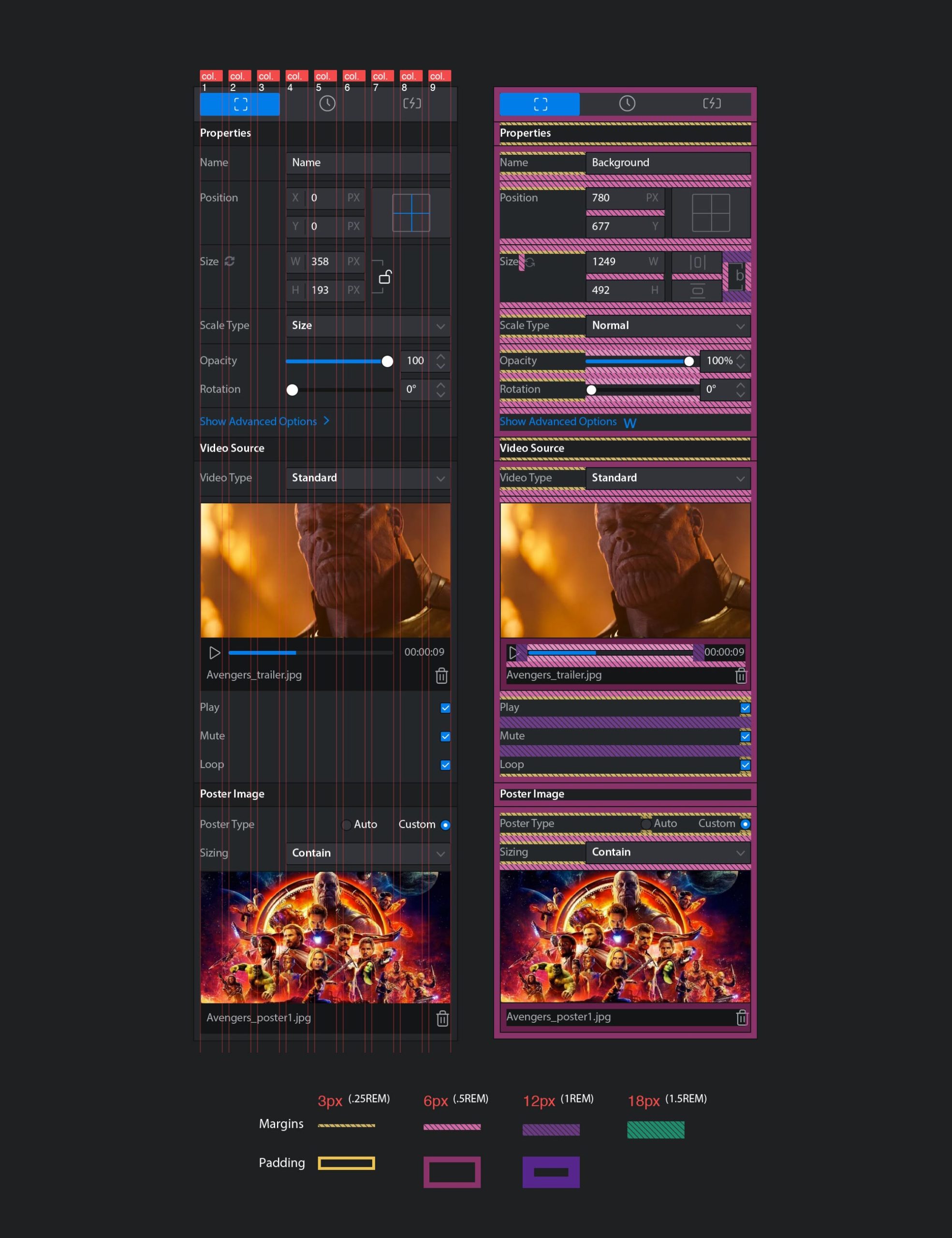
Senior Product Designer, Alex Andronicos, really took design hand off documentation to the next level, setting an incredible example for the rest of the team. Alex created extremely thorough design documents of each section including each associated component and relevant state. He even went as far as to color code the margins between each component for increased readability of the layout specifications.
Over 25+ Style Guides were created to describe in detail the design requirements for each section of the Composer UI.
WORKFLOW OPTIMIZATION
How we leveled up Composer to be a tool that everyone loved to use
Through in-depth user interview and validation testing, we designed new interfaces to manage some of the most complicated, yet common use cases. We tested our designs against these complex use cases to ensure our designs could accomplish the needs of the most creative designer.
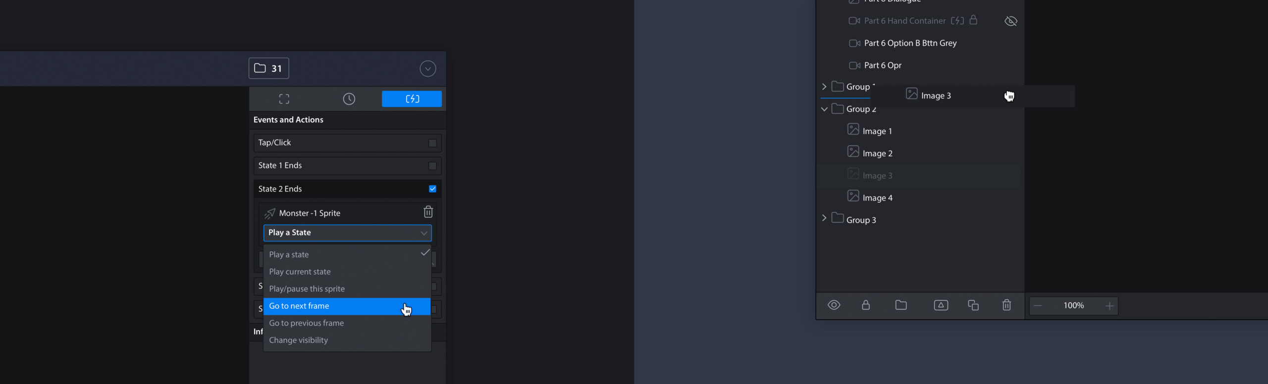
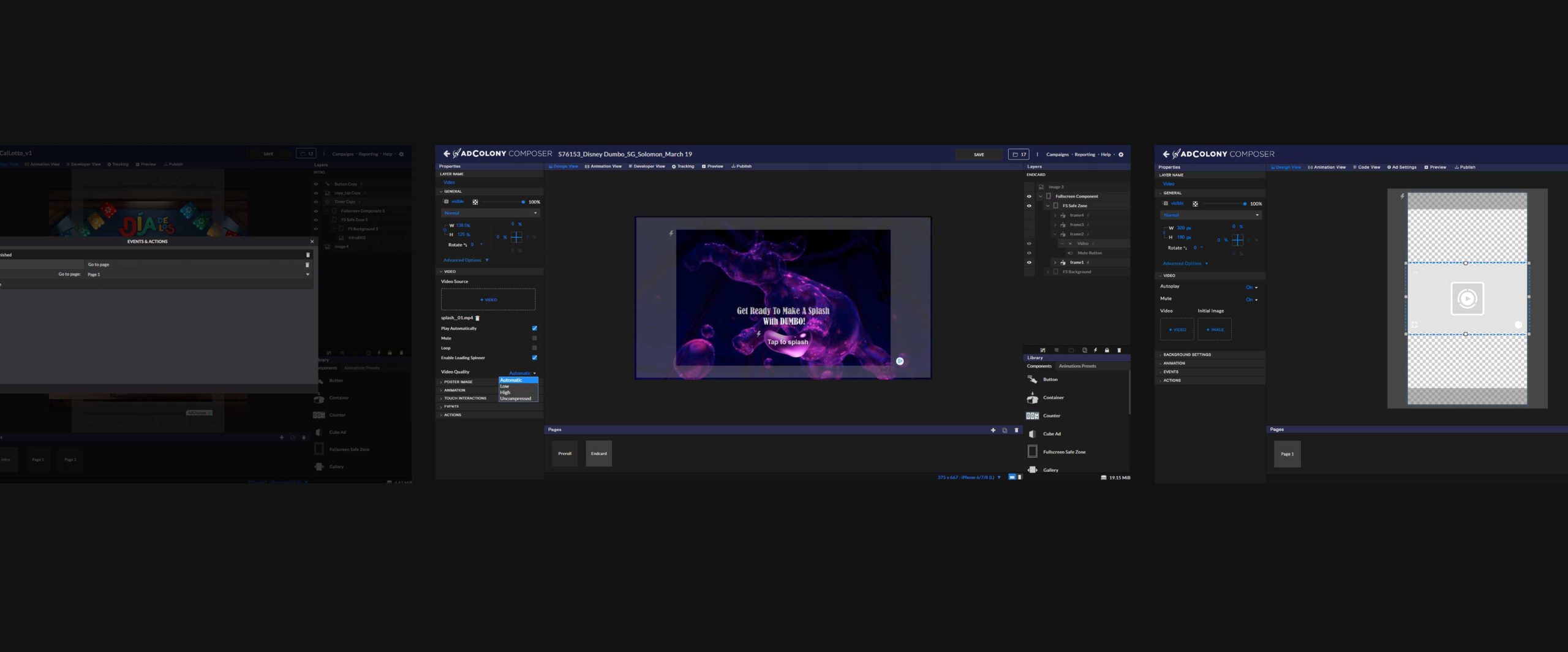
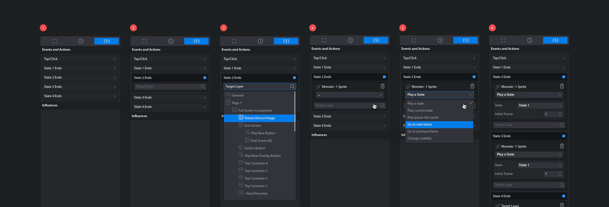
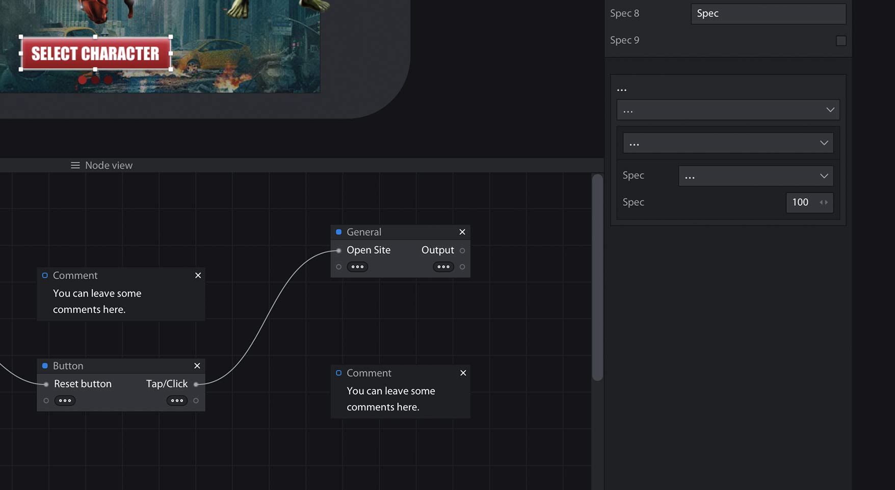
Events and Actions
Editing is easier when you can see what you're doing. Convert the Events/Actions modal into a sidebar so the objects are visible while editing.
Interactivity is one of the core features of Composer, so be sure to highlight layers that are using Events/Actions in the Layer Panel.
- Events and Actions are easily accessible to view by just clicking on any layer object.

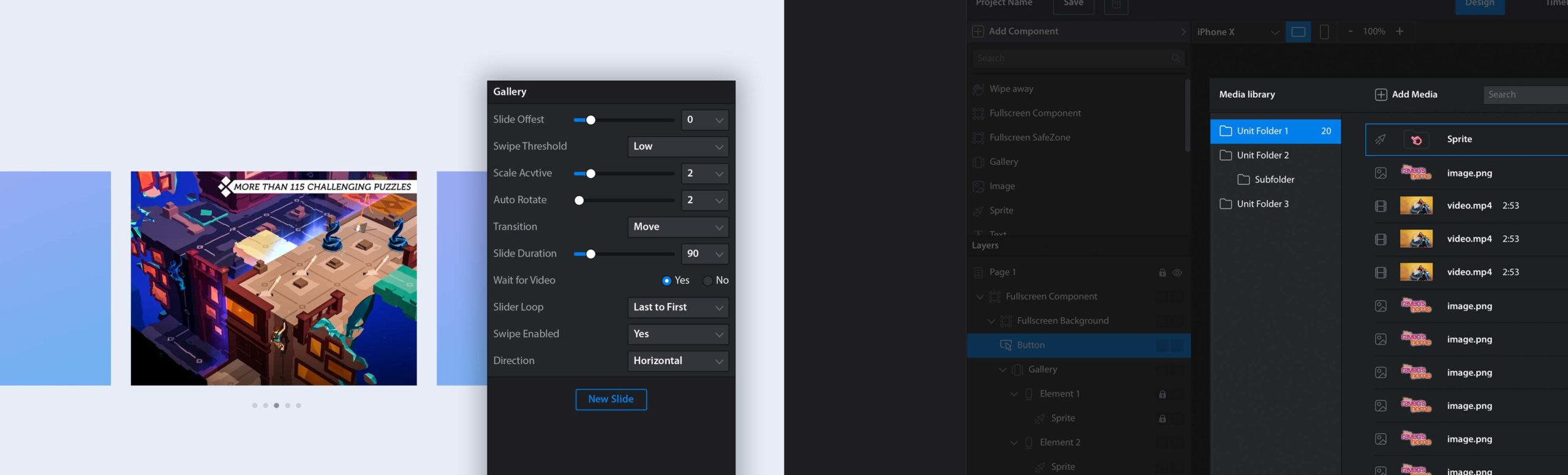
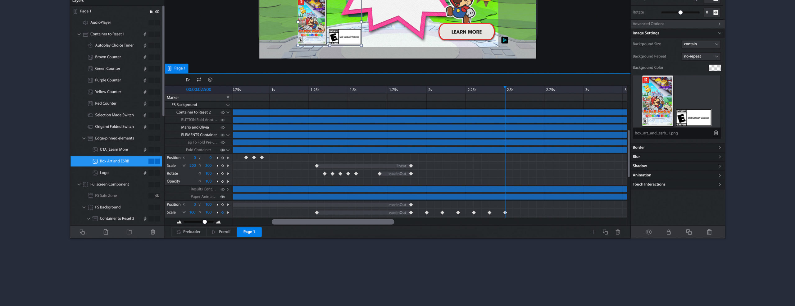
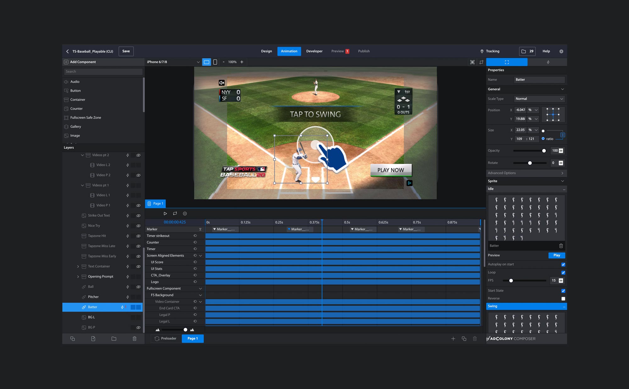
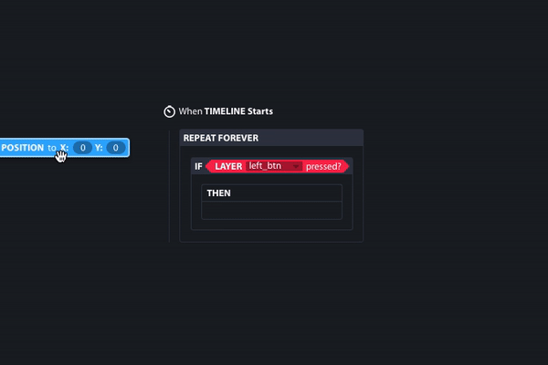
Animation Timeline
Timeline Markers as objects that can be configured with Events and Actions. By allowing Play and Pause actions targeted at different Timeline Markers, Creatives could loop video until the user took an action, or time certain actions to a video to simulate an interactive video experience.
For example, in the Ad Unit shown below, the user is prompted to tap the screen at the right time in order to successfully hit the baseball; tap too early or too late, and the batter will misss the ball. In this case markers are set up during the video showing a ball being pitched, of which if the user taps the screen at 2.0 seconds, the batter will succesfuly hit the ball. Invisible buttons are inserted at certain markers on the timeline. The successful swing button will be active between 2.0 and 2.5 seconds, allowing the user a 0.5 second opportunity to hit the baseball successfully.
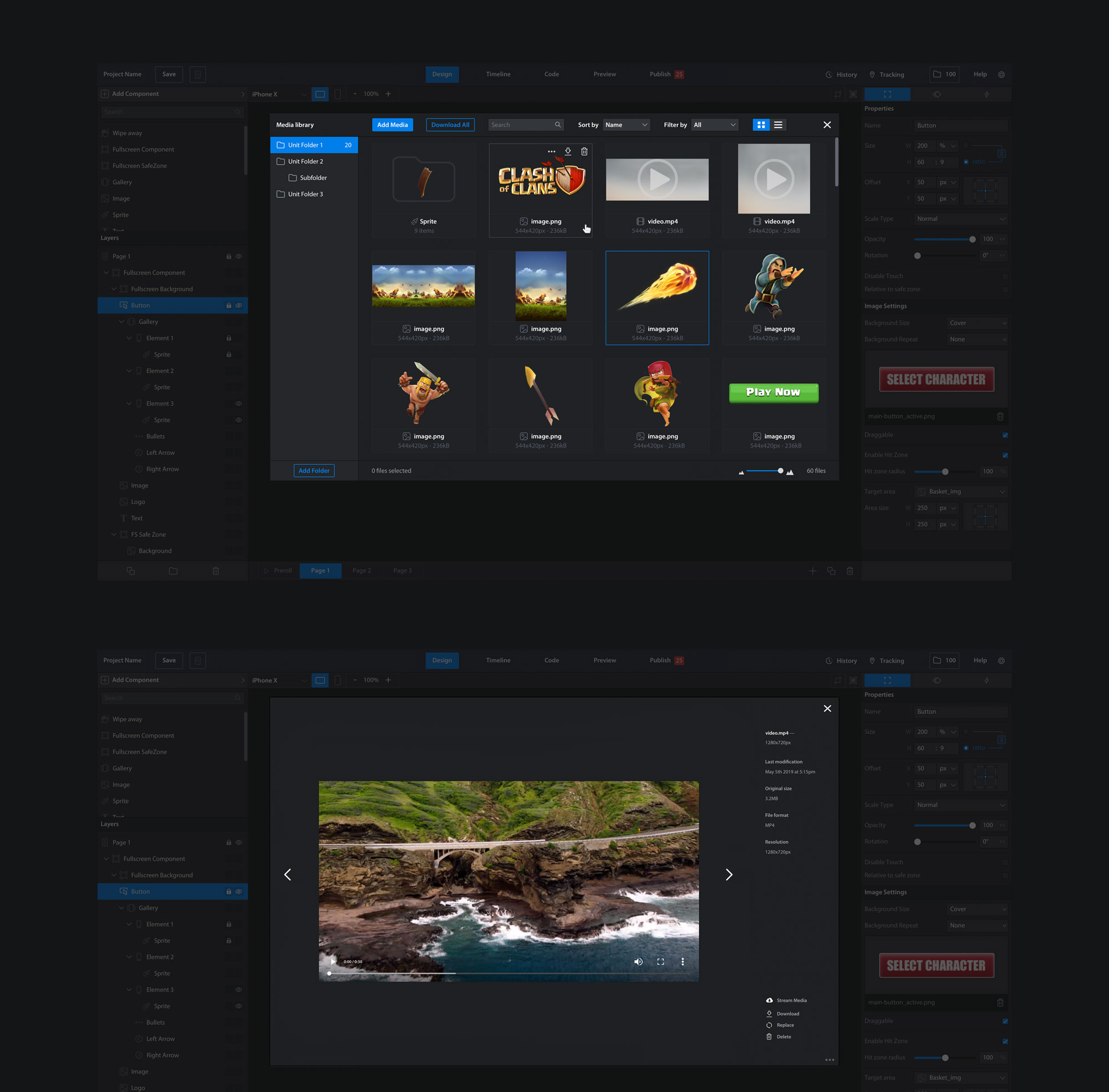
Media Library
Preview before applying! Large images and video assets were difficult to interpret in thumbnail version. Allow media assets within the Media Library to be previewed in full size before applying them to the Canvas.
Search Filters and List/Grid View. More tools to find the asset needed.
Keyboard Shortcuts
We designed and documented a suite of keyboard shortcuts based on those from common Creative Tools. Keyboard Shortcuts were validated with the Creative Team to ensure that they felt as familiar as possible.

And So Much More!
If you're interested in learning more details about the redesign, contact me.
EXPANDING PAST OUR CORE USER BASE
How positioning our mission around accessibility and usability expanded more ad production efficiencies and cost savings
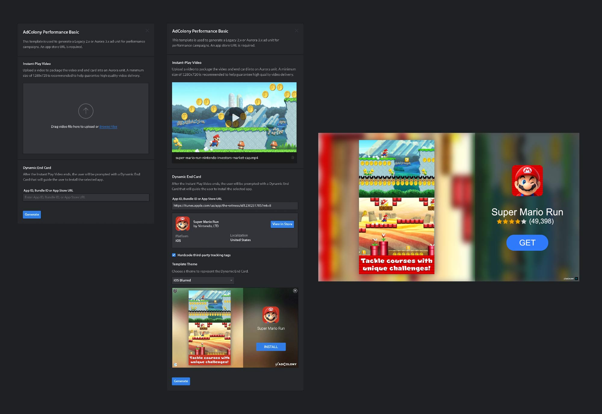
App Install and Brand Video Templates
We were able to validate during user testing that Account Managers and other users outside the Creative Team were much less likely to effectively use Composer in its raw and natural state. With a highly complex feature set, and lack of design skills, we needed a separate solution for non-designers to free up engineering resources and lower third-party costs.
We created a simple template for the most common Performance and Brand use cases. Users would only need to provide a few custom assets such as videos and images, and select a few parameters, and a Quick Start Wizard would create a baseline working Ad Unit ready to go. From there, users could Publish the Ad Unit and be done, or they could continue to customize the premise Ad Unit in the Composer editor before publishing. This feature resulted in Account Managers from being able to create basic Ad Units, which accounts for the majority of Ad Unit production, independently of Engineering and Creative resources resulting in accelerated throughput and efficiency.
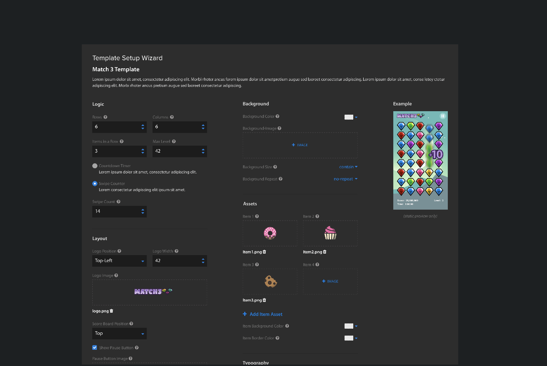
Playable Reskin Templates
In order to streamline the most developed Playable Ad Units, several Playable Templates have been created for game verticals such as "Match 3" and "Slot Casino", etc. Game parameters such as time out duration, and assets could be swapped to skin the appearance to represent the advertised game. These parameters can be adjusted to tailor a game mechanic to the advertised app.
KEY RESULTS
Current State of Affairs
- Composer Adoption Rate is at over 98%, which is a 320% increase from when our baseline measurements began. Engineering support is still required for the most cutting edge, high spend, custom Ad Units.


- Marginal fees paid to Celtra have dropped by 100%. Celtra is no longer used by the AdColony Creative Team and our license has been terminated.

- Minor bug reports are down by roughly 60%, and user satisfaction and trust in the tool is at an all time high.

- The Creative Team uses the tool every day to produce Ad Units. Usability frustration is at all time lows.

- Account Managers use Composer for all simple App Install Ad Unit builds. Engineering Support is no longer needed for this use case.

- User onbarding for new hires in the Creative Team is reported to be at an all time low.

- The #composer-fixes Slack channel, which captured the most urgent usability issues and minor bugs, is nice and quiet.

THE FUTURE
Onward and Upwards 
The ambition for enabling Creatives to build the best possible Ad Units is still alive and well. Some of the more exciting upcoming features include:
- Node Based and Block Based Logic Editors
- Multi-Select Objects
- Undo Actions!


PRODUCT DESIGN TEAM
- Lead Design: Brandon Chau
- Senior Design: Alex Andronicos
- Design: Andrzej Domagala
- Design: Shannon Ray
- Design: Kelly Zerga
©2020 Brandon Chau — bchau.com